
Print + Branding
-
Valentine's Day Merchandising Tool Kit for LCBO
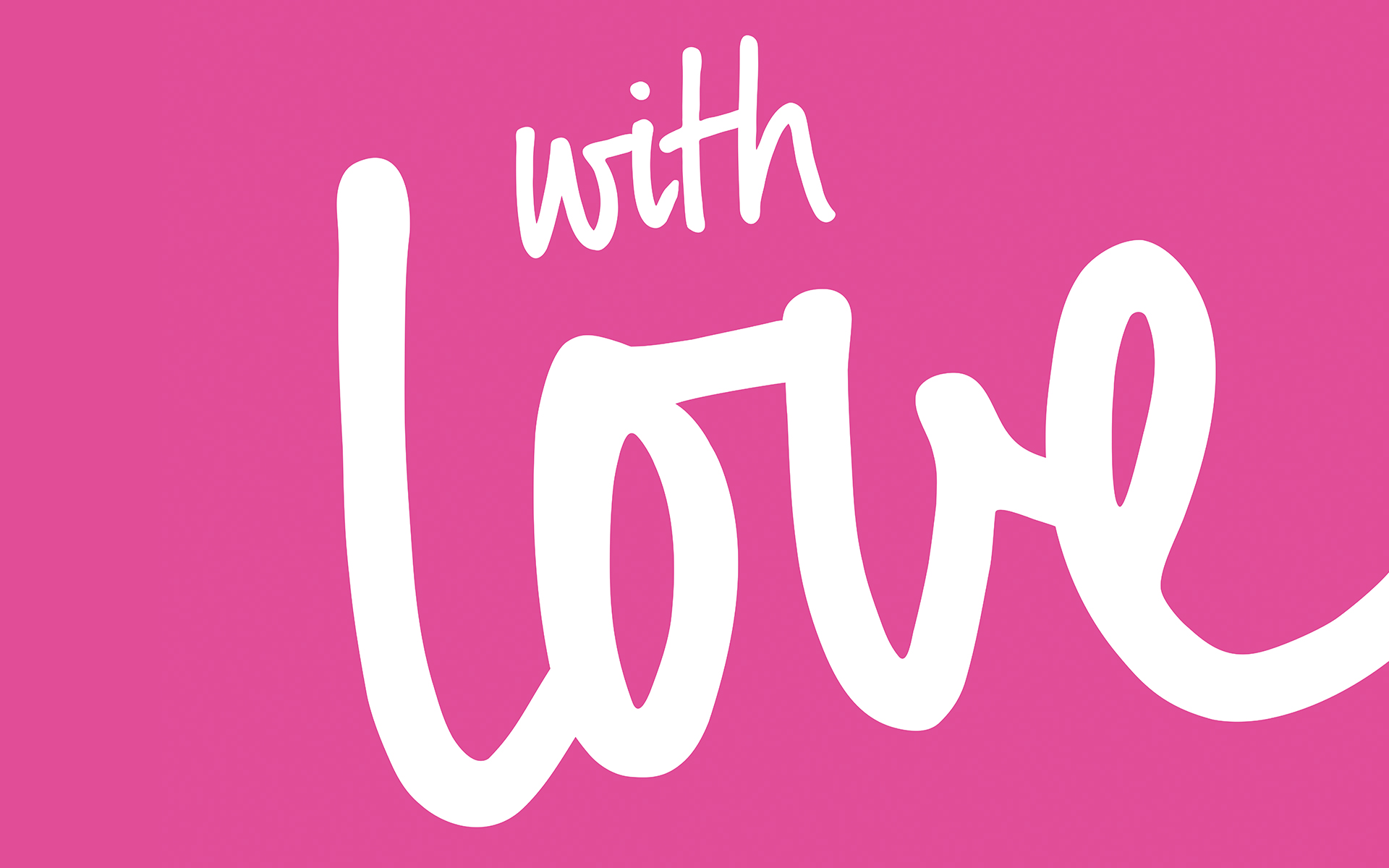
Valentine’s Day is one of my most favourite special days of the year. To celebrate the day of love at the LCBO, I designed this visual identity for the Valentine’s Day merchandising tool kit. Merchandising kits are provided to the retail stores to celebrate and decorate special occasions and holidays during the calendar year. Their other purpose was to discourage store staff from decorating with cheap and off-brand tchotchkes from the dollar store. Each kit provides signage and other components to promote the selection of curated products for each occasion. What’s not to love? Hearts, hugs and kisses!
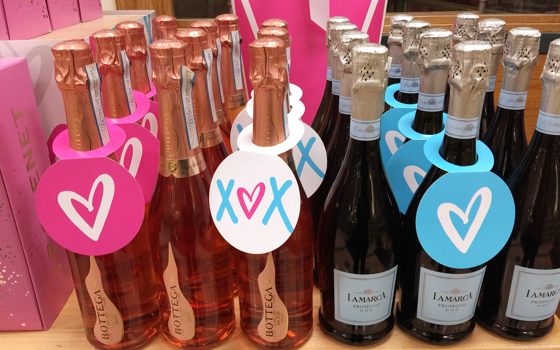
Bottle-Neck Tags
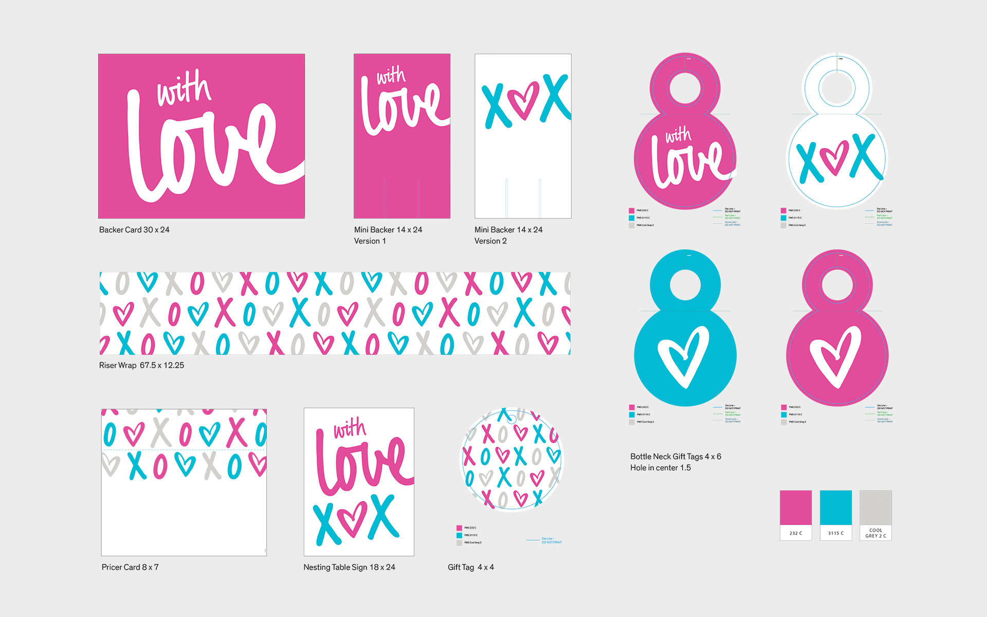
Contact Sheet
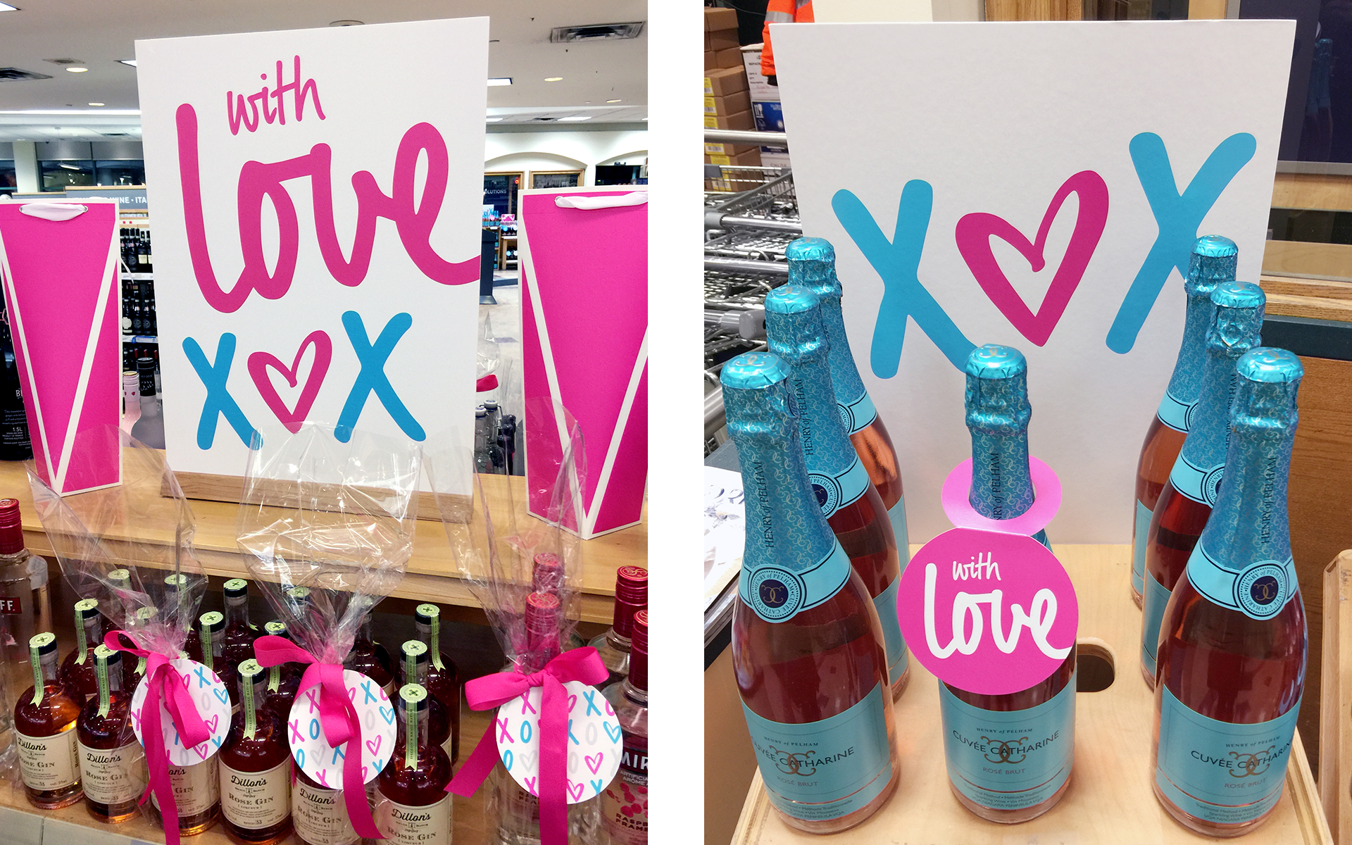
Signage and Gift Tag
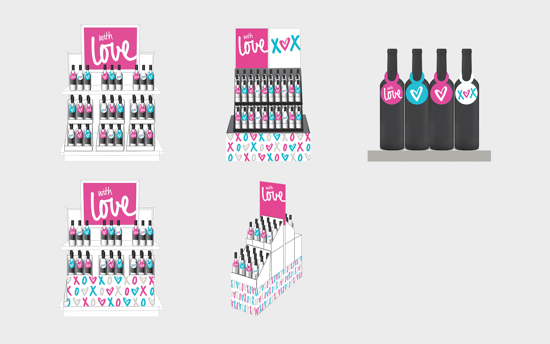
Merchandising Plan
I was also responsible for an entire calendar year of merchandising kits for these holidays as well: Easter, St. Patrick’s Day, Mother’s Day, Father’s Day, Thanksgiving and Halloween.
VISUAL IDENTITY / PRINT READY FILES
-

Eco-Friendly Packaging for Wean Green
I am always excited to work on packaging projects, including this one for Wean Green, a company that manufacturers reusable tempered glass food containers. Started by an entrepreneurial mom with two young girls, her mission was to create eco-friendly, unbreakable and microwavable safe food containers. After the initial launch, the product line grew by adding additional shapes of the containers to suit the needs of busy moms. Since the branding identity for Wean Green was already established, my design skills were engaged to leverage the brand to create the artwork for five new skus in the product line.
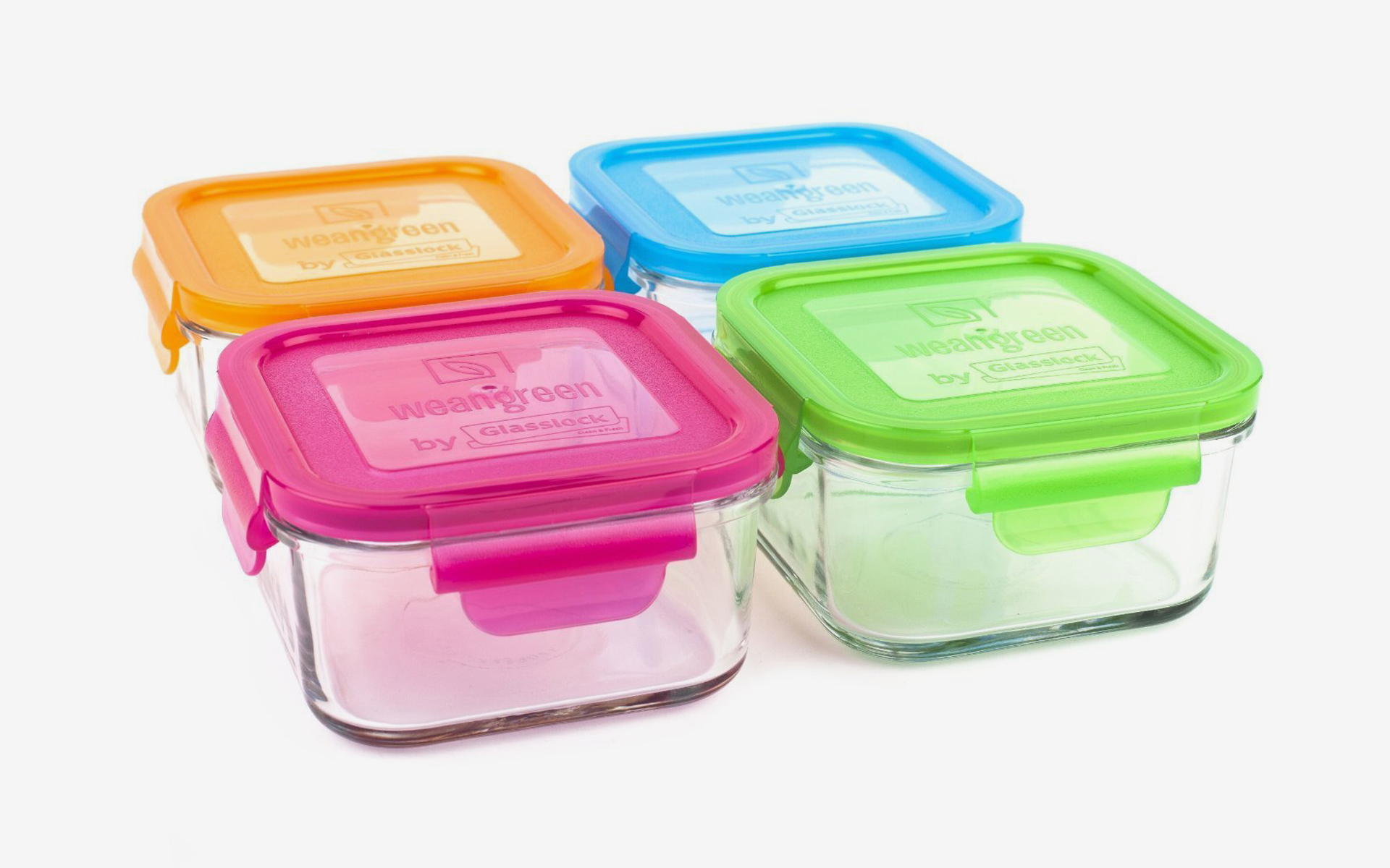
I loved working with the playful colour palette, inspired by healthy fruits and vegetables: carrots are orange, raspberries are pink, blueberries are blue and peas are green. In keeping with the eco-friendly nature of the product, the containers were packaged in 100% recyclable material and Wean Green donates 1% of their profits to environmental organizations (1% for the Planet).
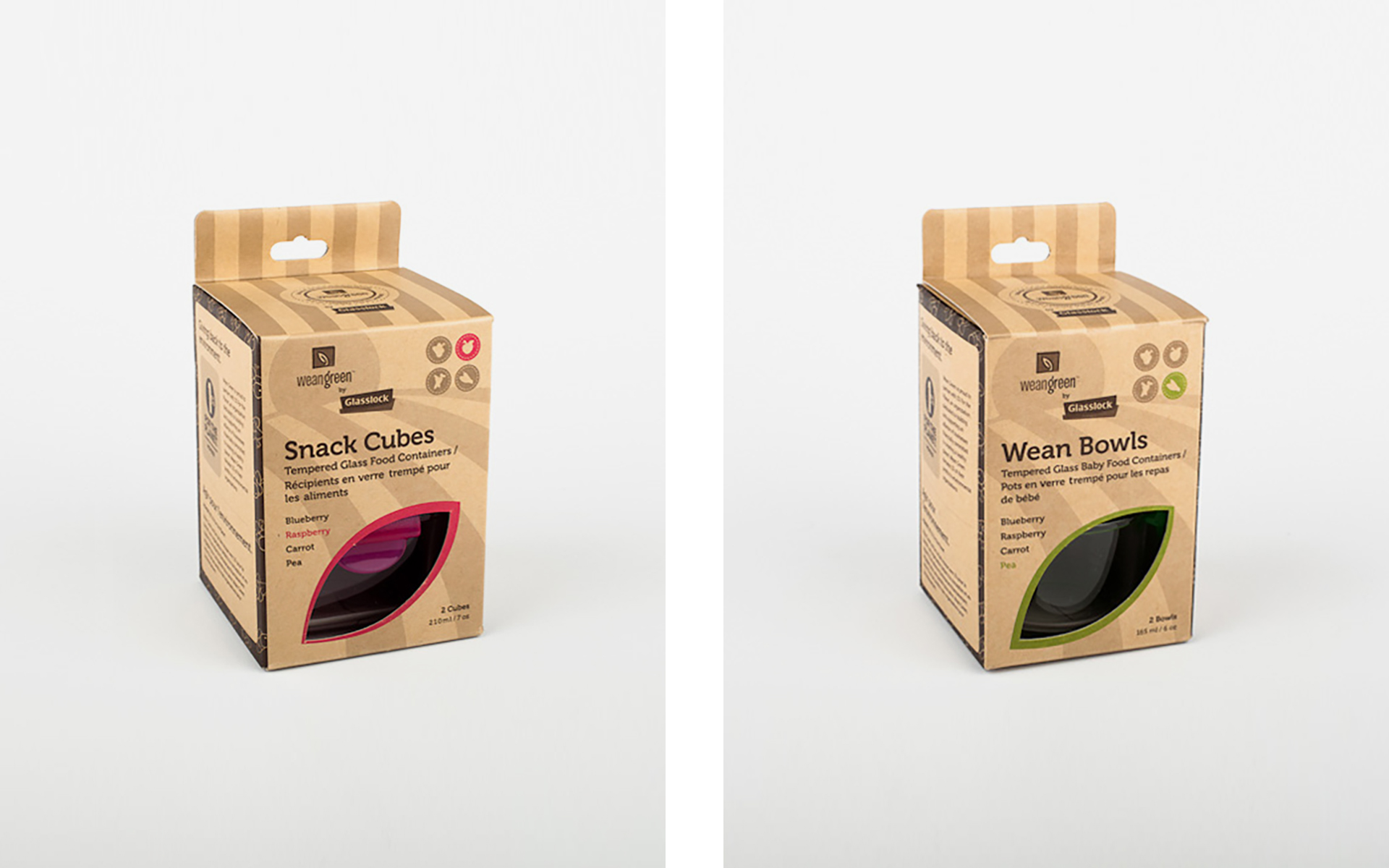
As the glass food containers were being manufactured in Korea, the factory was also responsible for the printing of the packaging. For efficiency and accuracy, I was provided illustrator templates for each new product sku from the printer. I proposed a new die line to be in a shape of a leaf, to visually connect back to the Wean Green logo.
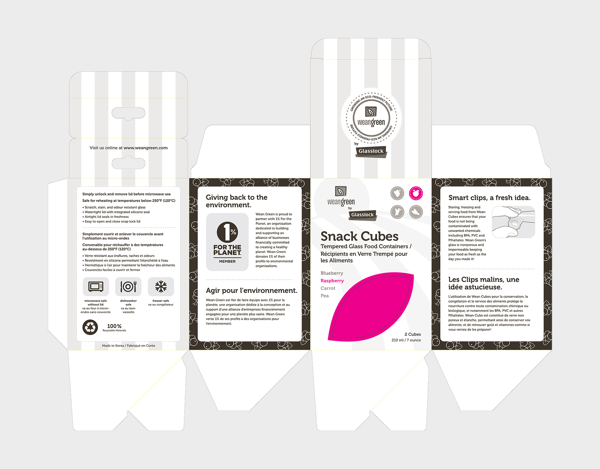
The most challenging aspect of the project was managing the time difference between Korea and Canada. Working as a freelance graphic designer, I was able to accommodate my working schedule to be available ‘first thing in the morning’ — checking emails at midnight to follow up and make sure all aspects of the project was moving forward smoothly.PACKAGE DESIGN / PRODUCTION
-
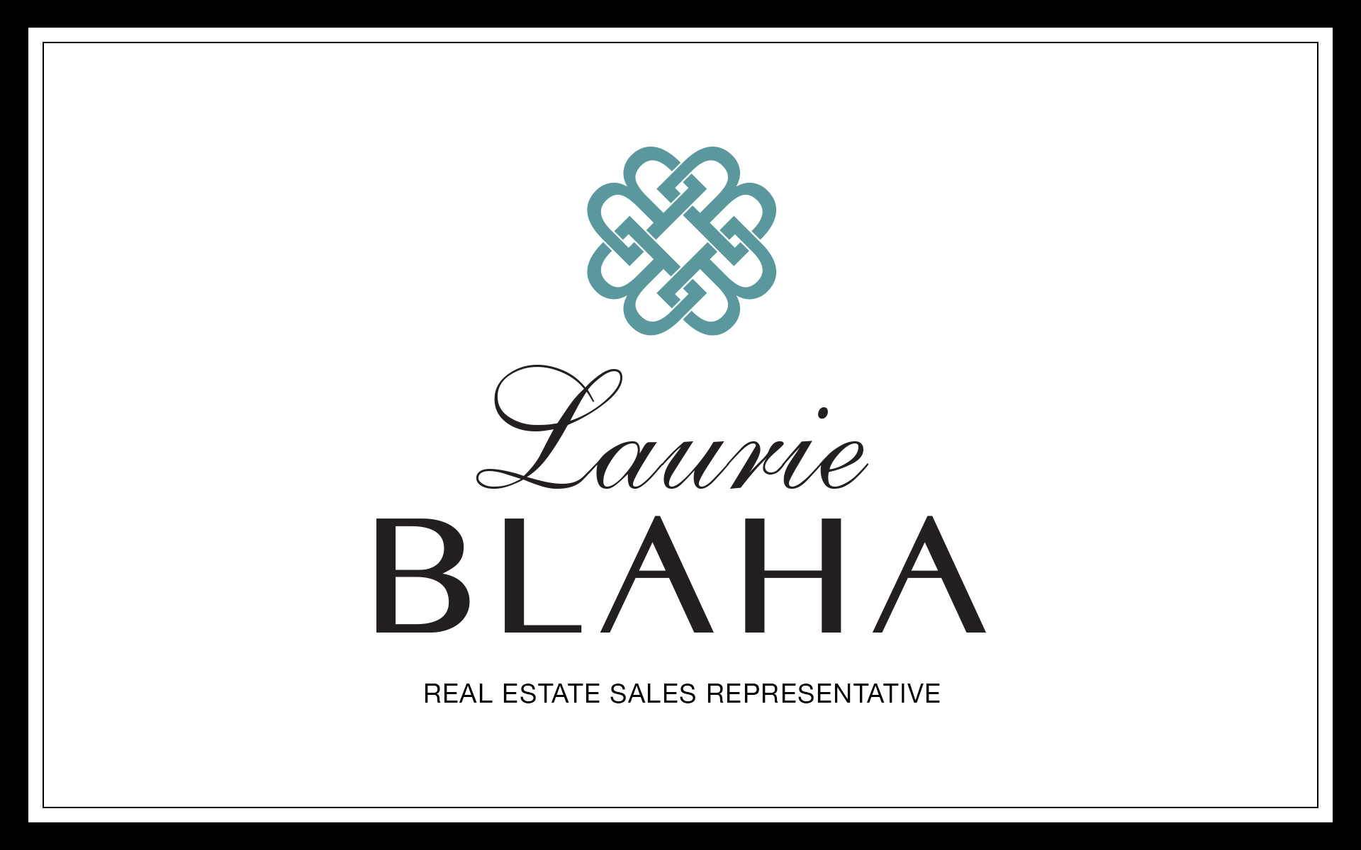
Brand Identity for Real Estate Agent
Laurie Blaha just earned her real estate license and desired to have a brand identity that would set herself apart from other Royal LePage agents — professional, classy and elegant, sophisticated and knowledgeable. I created the icon of interlocking ‘B’s which emphasized the initial of her last name for the bold and architectural element she was looking for. The client absolutely adores her new brand identity on all of her marketing materials which others have said is ‘.....so Laurie’.
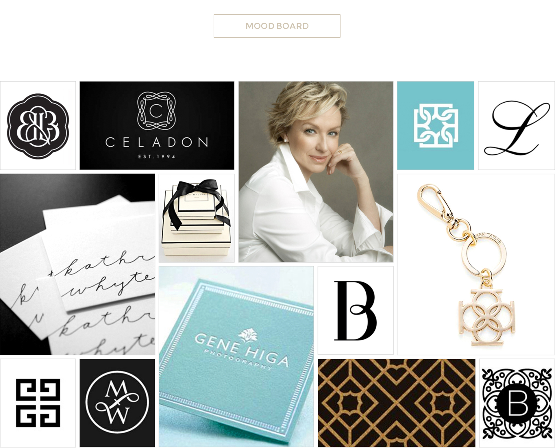
Pulling from Laurie’s inspirations on Pinterest, I created a focused mood board which captured the visual direction of her new identity — elegant and sophisticated — to portray a knowledgeable and professional presence.
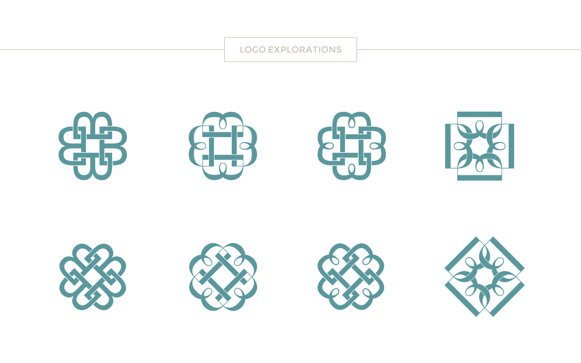
I explored options of interlocking ‘B’s — which emphasized the initial of the clients' last name — for the bold and architectural element she was looking for.
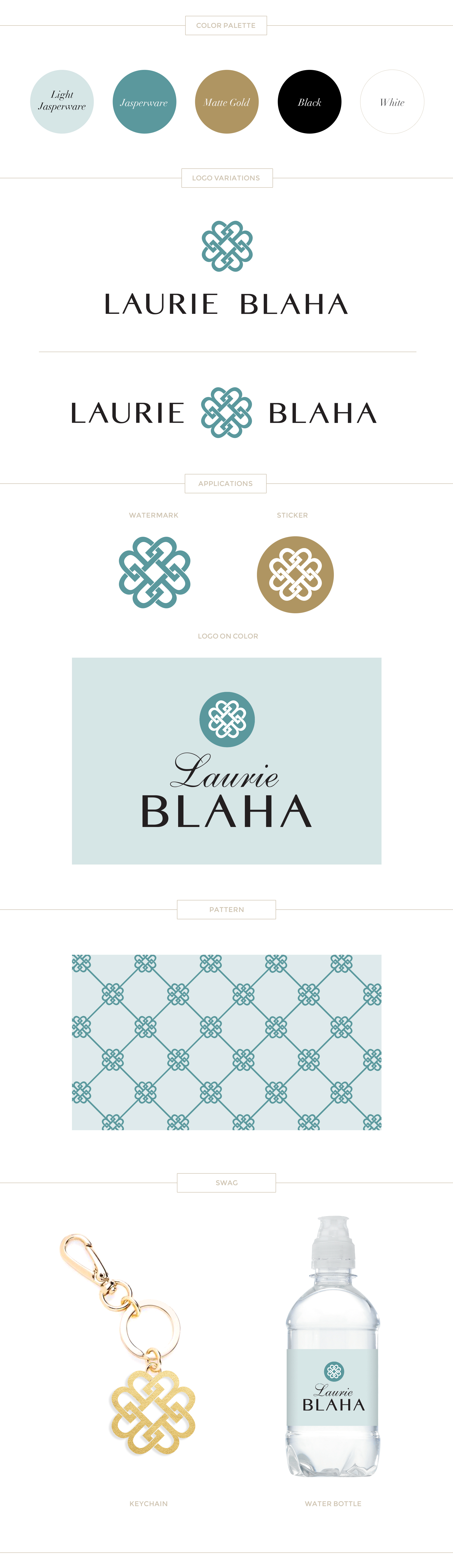 The client absolutely adores her new brand identity on all of her marketing materials — including business cards, signage, postcards and more.
MOOD BOARD / LOGO DESIGN / BRAND IDENTITY
TESTIMONIAL
‹ ›
I had the pleasure of working with Paige on my branding for my real estate business. Her detailed and thoughtful approach was excellent as she created a logo I love as well as a unique and impactful colour palette for my brand. Paige listened to my needs and wants and interpreted them beautifully. I receive many compliments on my branding all the time! My signs and marketing material stand out in a very crowded market thanks to Paige. I would certainly work with her again and highly recommend her services.
Laurie Blaha
Real Estate Sales Representative
RE/MAX Aboutown Realty Corp Brokerage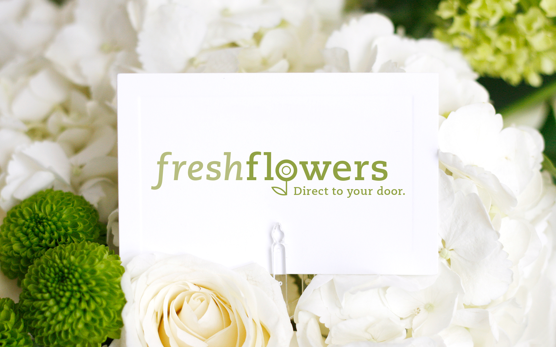
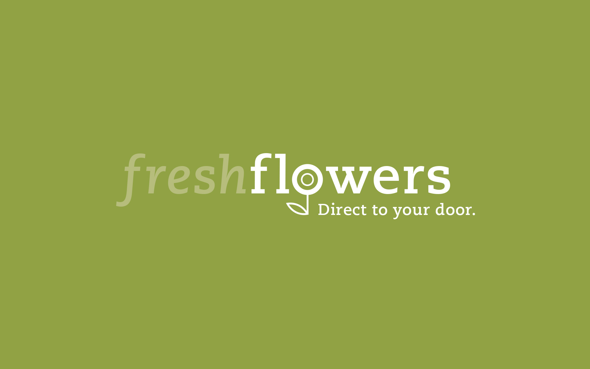
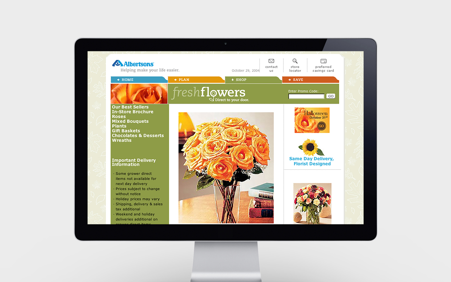
Logo for Albertson's Flower Department
After a redesign of albertsons.com was completed, the client reached out to Critical Mass to also create a new ‘fresh flowers’ logo for the flower department both in-store and online. After many creative rounds, I was brought on the project to bring in a fresh and ‘feminine’ design aesthetic. The client loved their new logo; simple, clean and witty treatment of the ‘O’ as a stylized flower.
LOGO DESIGN
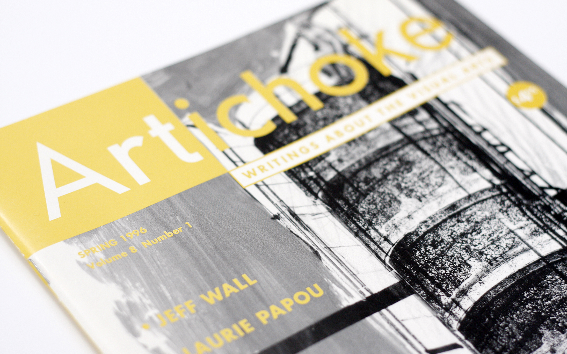
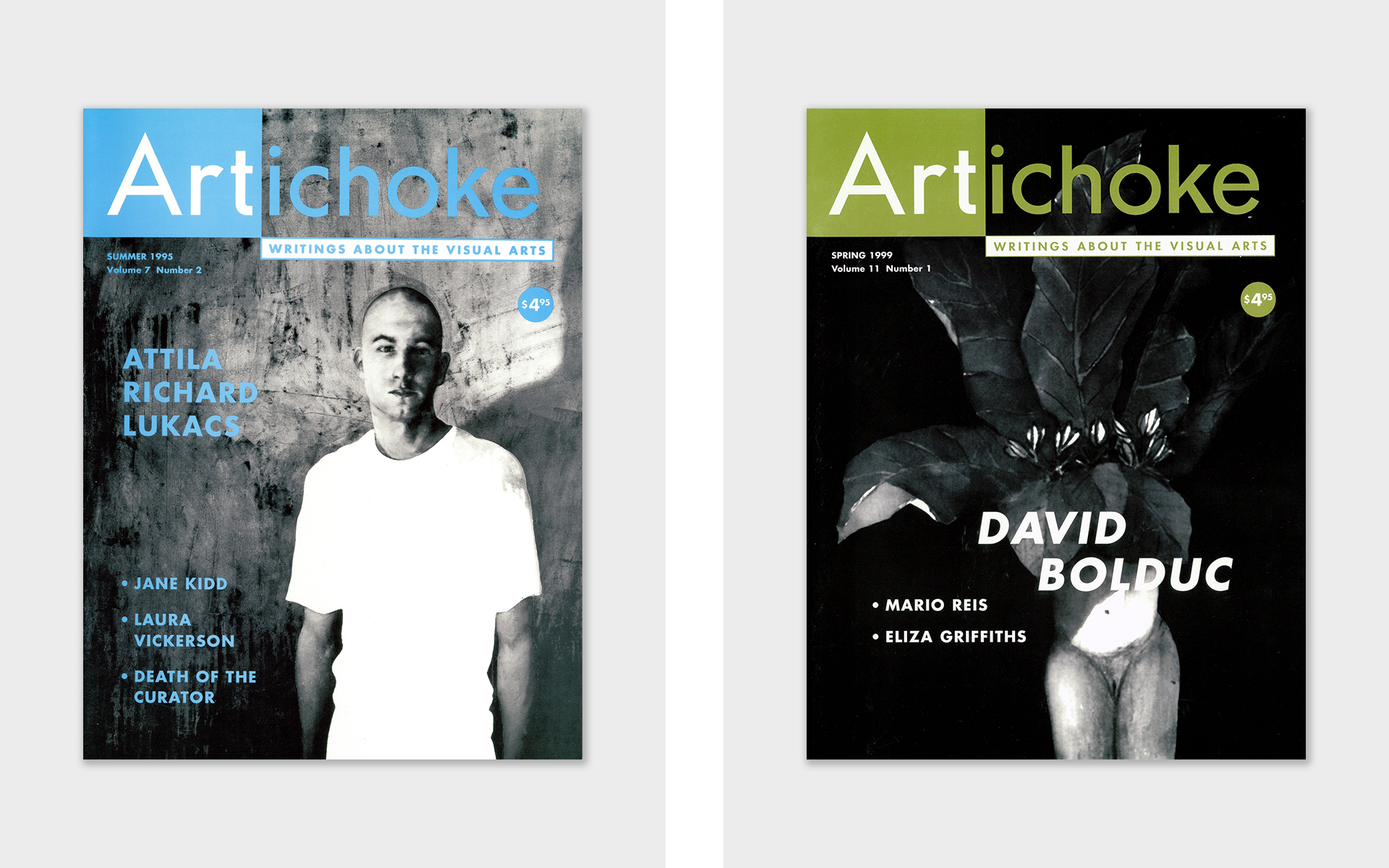
Award-Winning Artichoke Magazine
For seven years, I organized the editorial content and designed the layout of the magazine which was published four times a year. I also approved the blue line of the sixty-four page magazine for final printing and communicated back and forth with the editor who lived in a different city via phone, fax and email. During my time working on Artichoke magazine, it was recognized as Magazine of the Year at the Western Magazine Awards.
BRAND IDENTITY / LAYOUT & DESIGN / PRE-PRESS APPROVALS

