LCBO Gift Card Carrier Concept


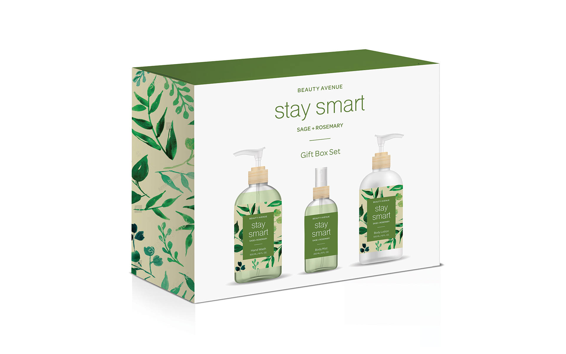
I designed this branding and packaging project for Upper Canada Soap, a bath and beauty company. The marketing director was looking to introduce a new bath program to be sold at one of Canada’s leading drug store chains. The intention of the program was to attract the millennial consumer who would otherwise be shopping at Sephora and Victoria Secret. The mission was to create a brand with strong shelf presence to attract this demographic: 18 – 35 years old, social media savvy, aware of high end brands yet very price conscientious. I researched into the millennial mindset to understand their goals, motivations and pain points. And to gain an understanding of the current market, my research involved visiting brick and mortar drug stores, as well as the beauty competitors in the retail industry.
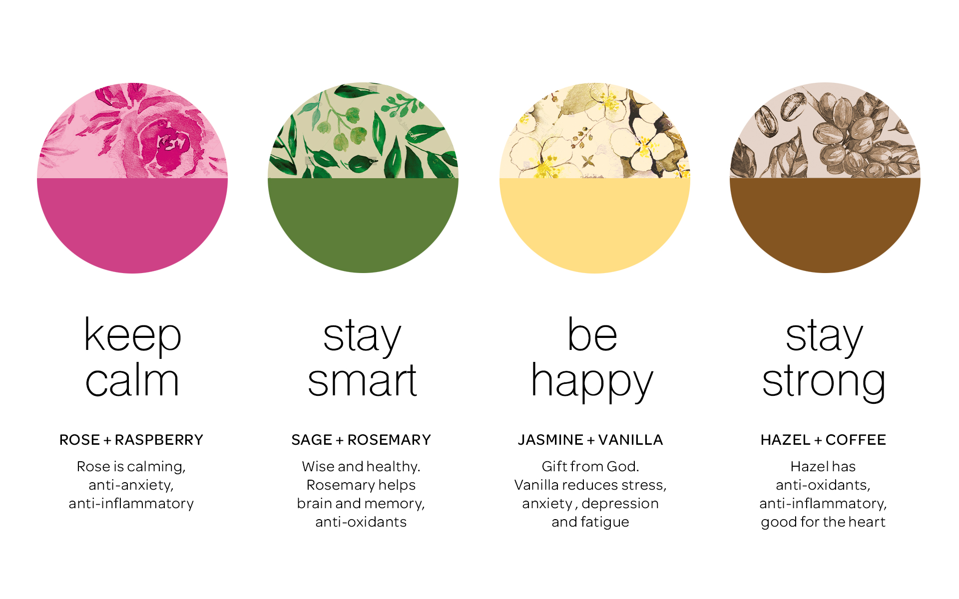
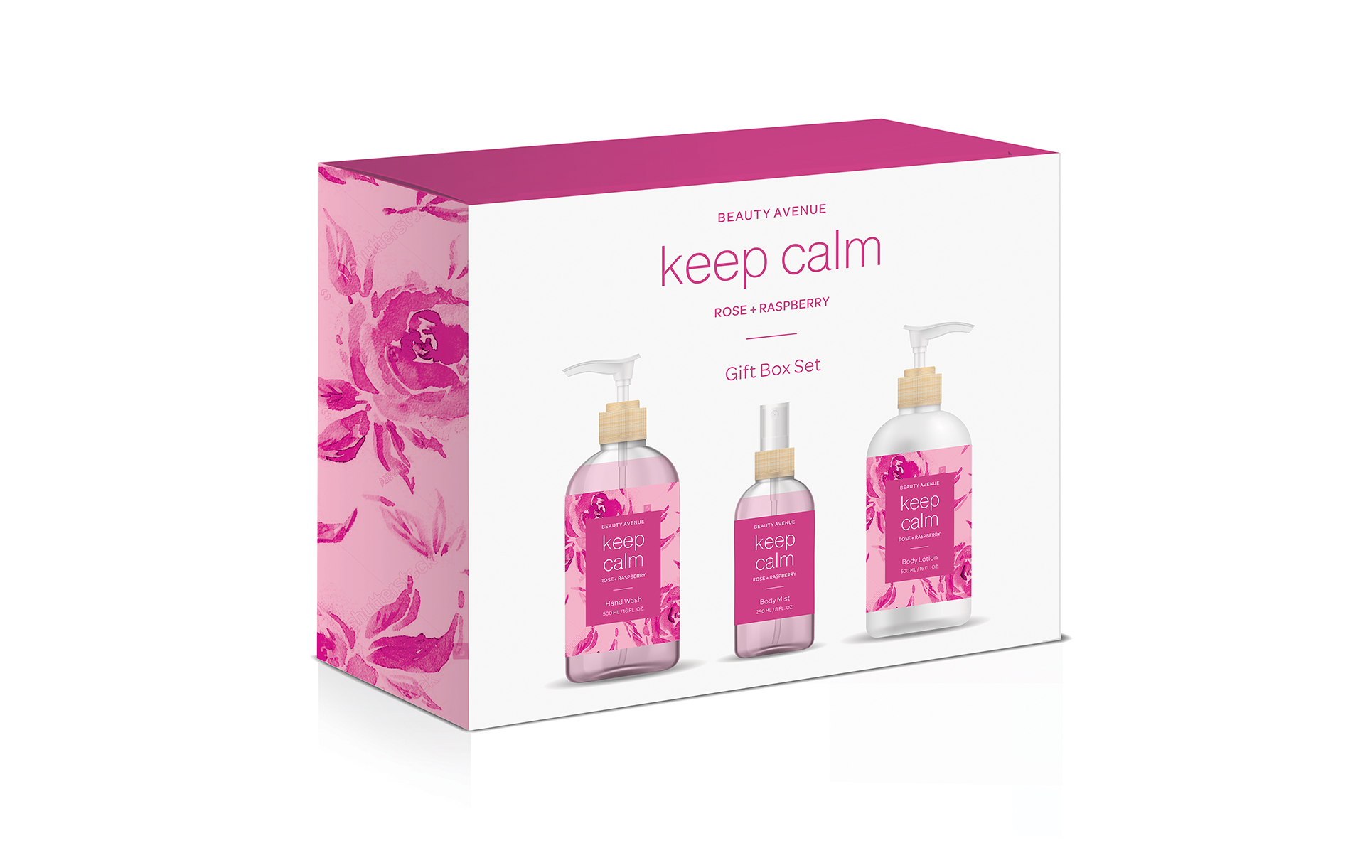
The brand personality was to be fun, fresh, smart and down-to-earth with a bit of luxe. As I was brainstorming ideas, the direction of the fragrances was inspired by girl names, which sounded pretty and playful. My approach combined these names with honest, simple ingredients of flowers and herbs. As the prominent benefit, the health properties of the fragrances were captured with simple and positive expressions. For proof of concept, I designed two out of the four fragrances required in the program.
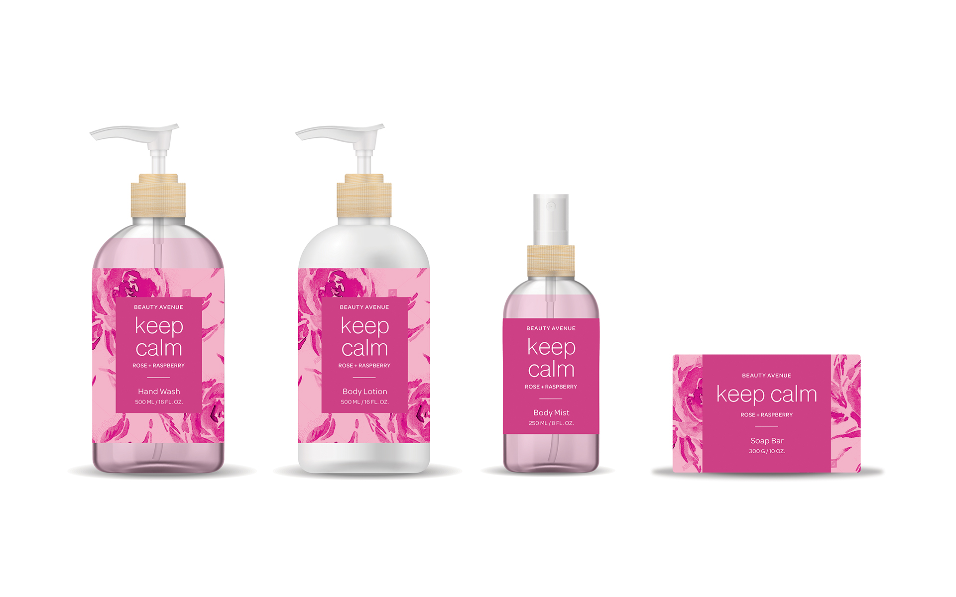
Including the name ‘Beauty Avenue’, the line of bath products included: hand wash, body lotion, soap bar, body mist; and a boxed gift set as well.
The bright colour palette was selected for high visibility image on drug store shelves and Instagram-worthy shots. And the use of nature-inspired illustrations promoted a feeling of fun, fresh, health and wellness.
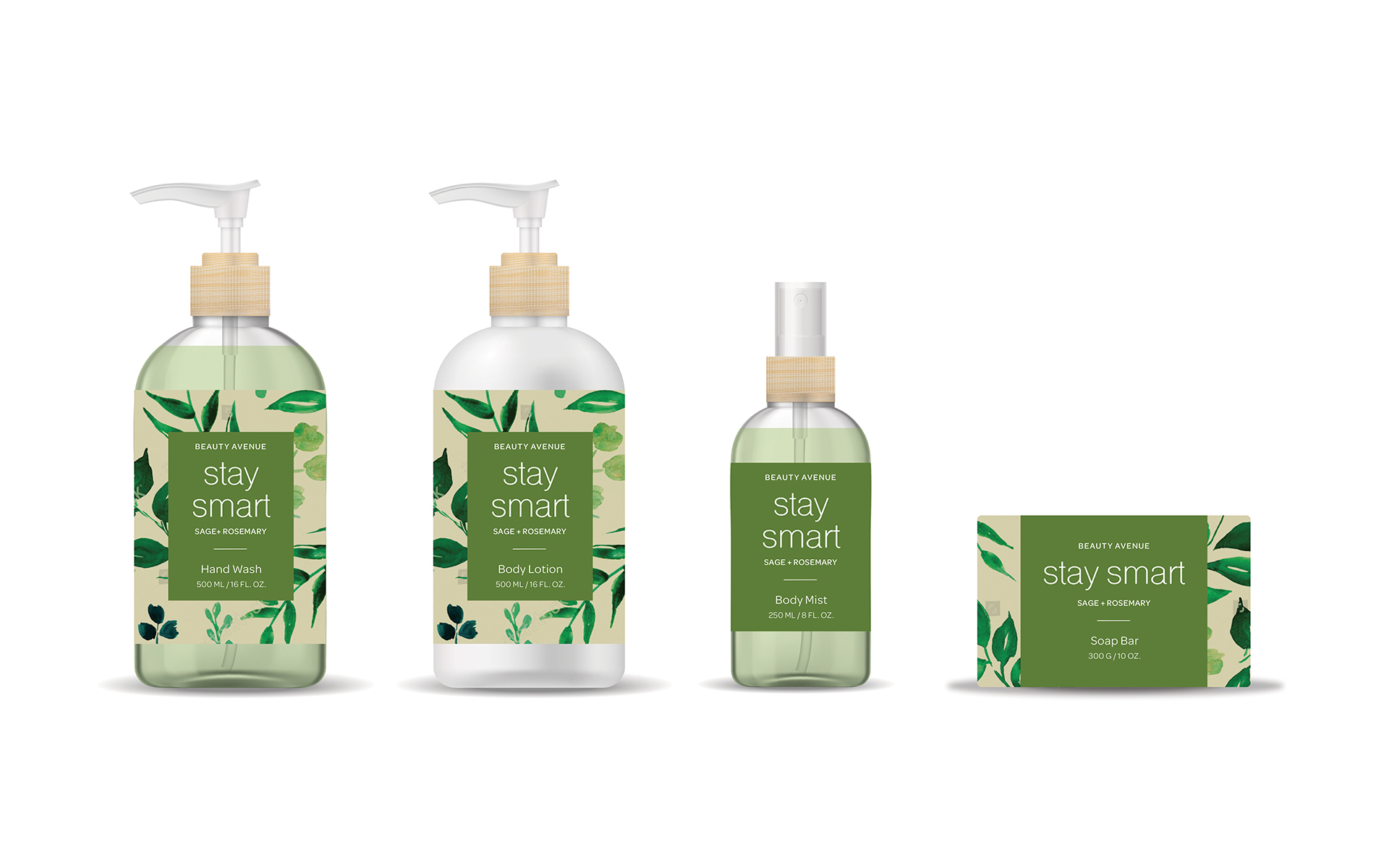
As millennials are connected to the way ingredients affect their overall health, the natural ingredients would be: 100% organic, bio-degradable, non-toxic and sourced in Canada. Sustainability is also important to them, so careful attention was given to the type of packaging materials used: glass instead of plastic for 100% recyclable, eco-friendly material.
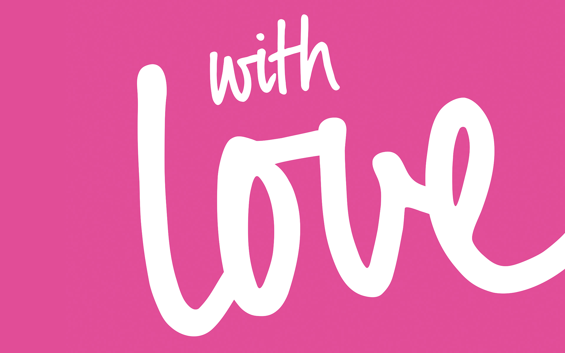
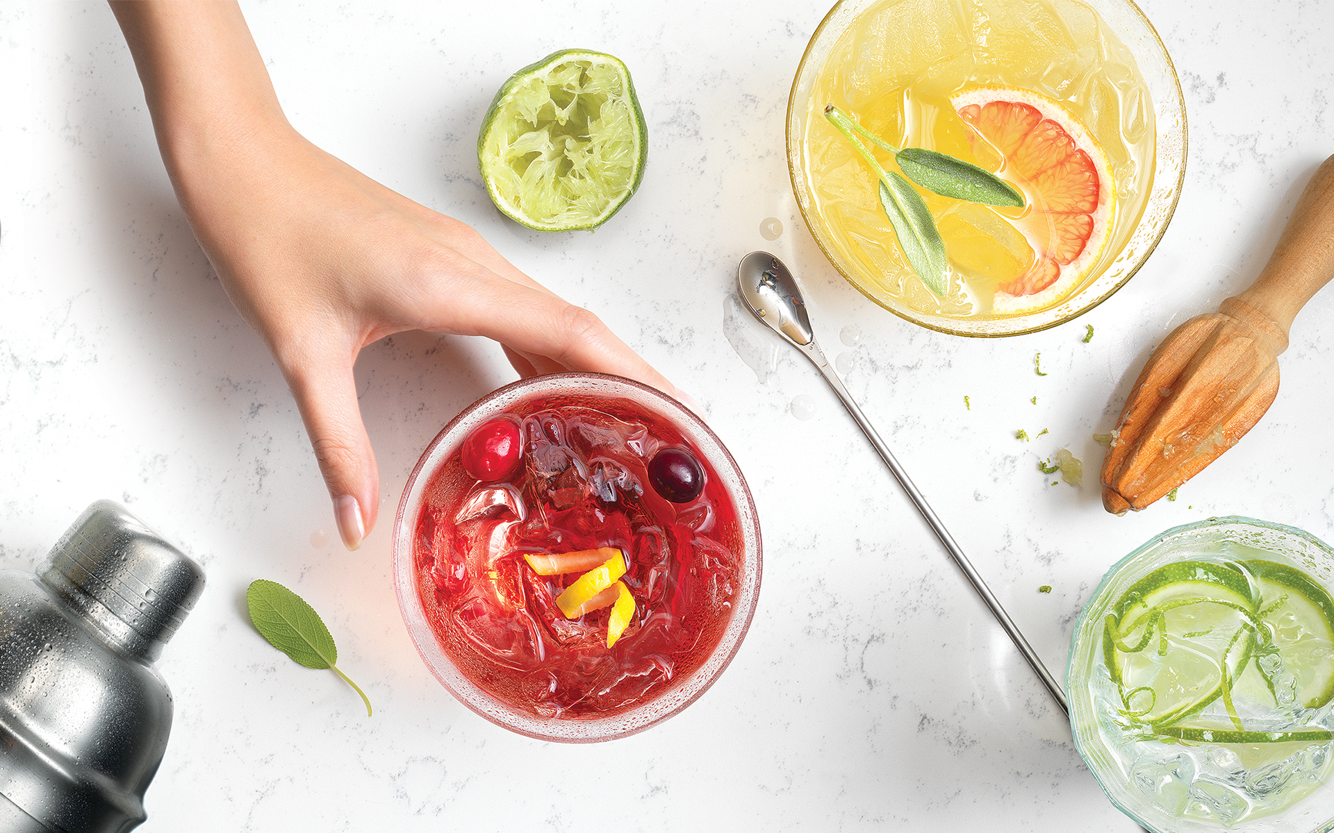
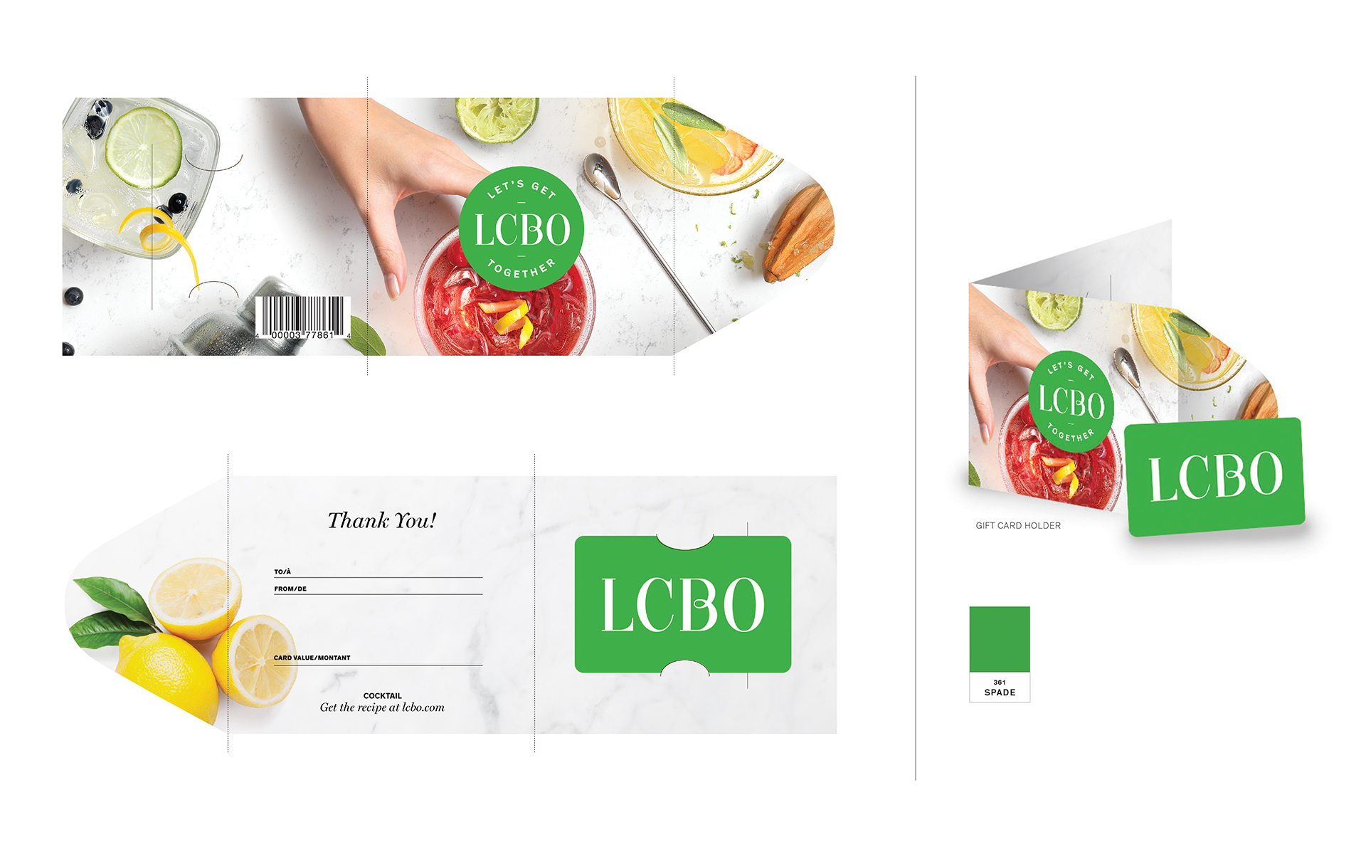
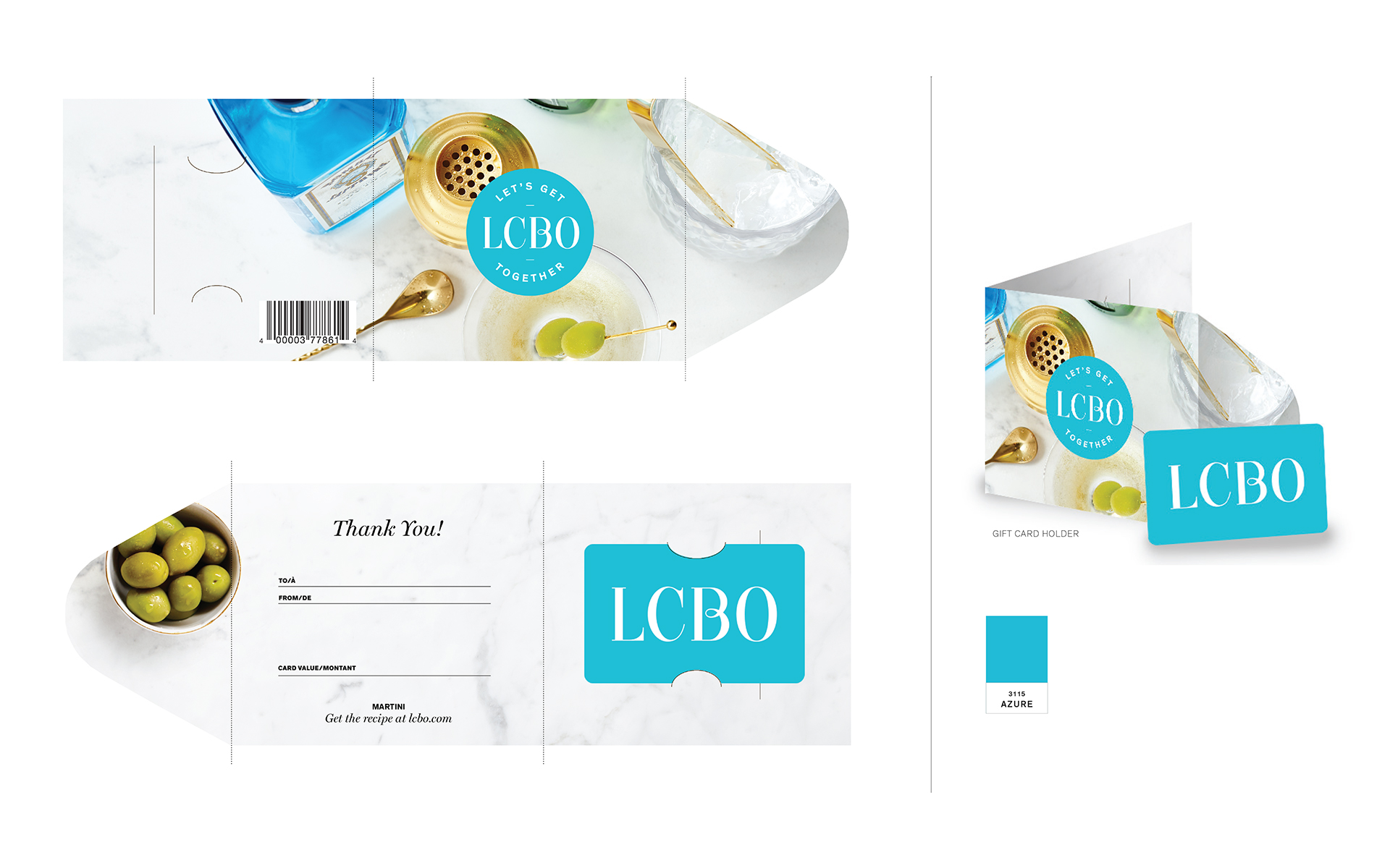
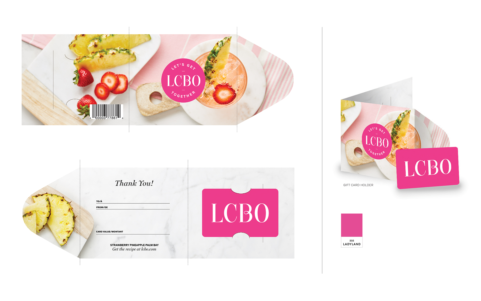
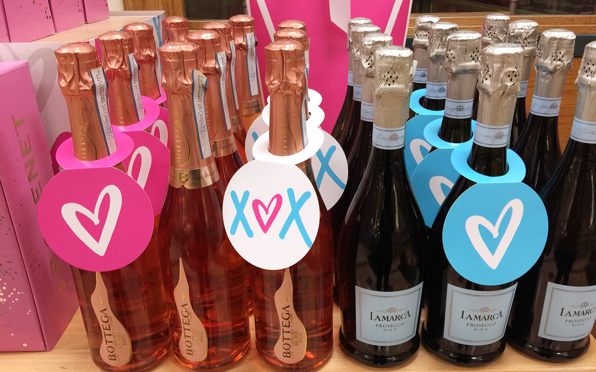
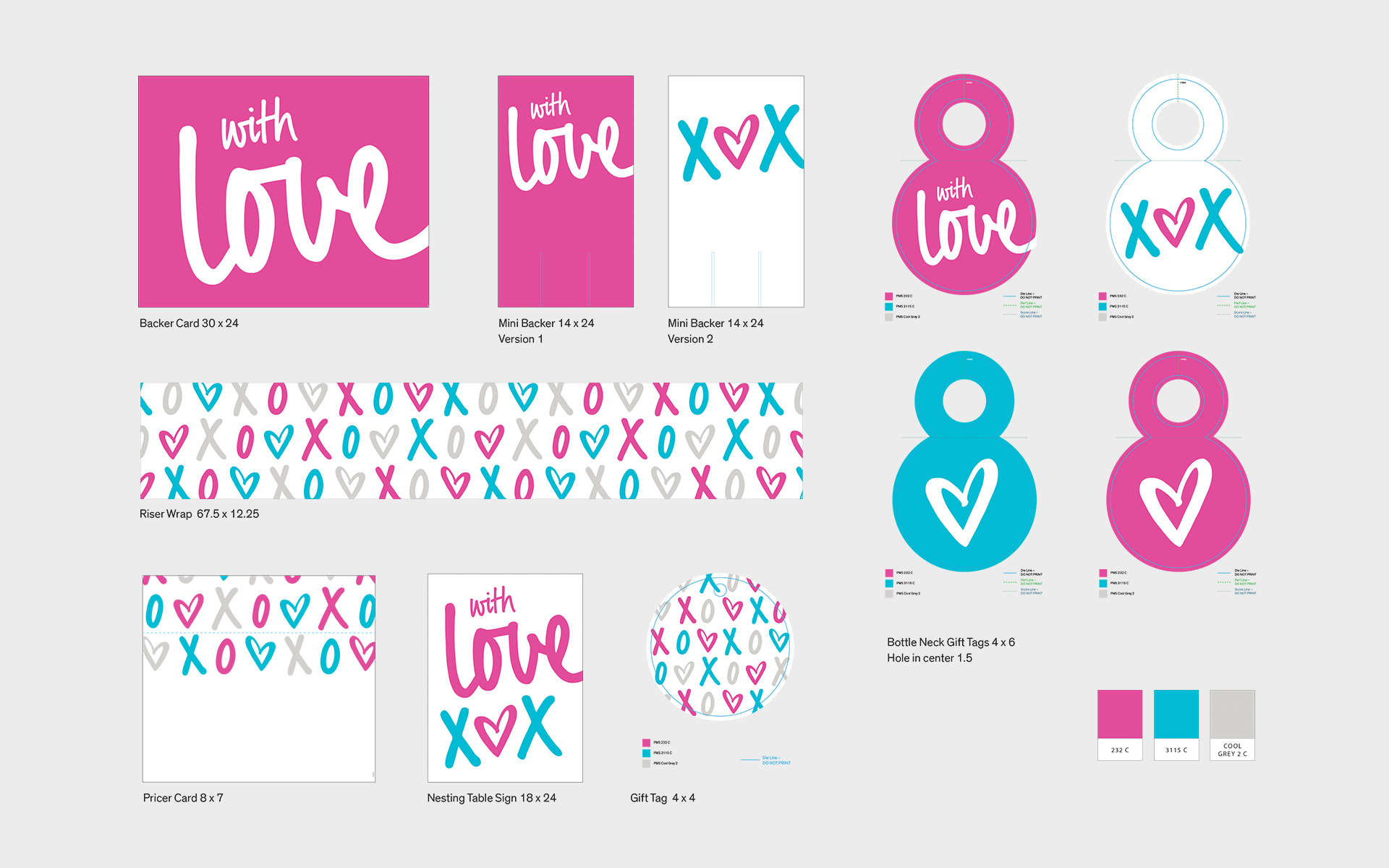
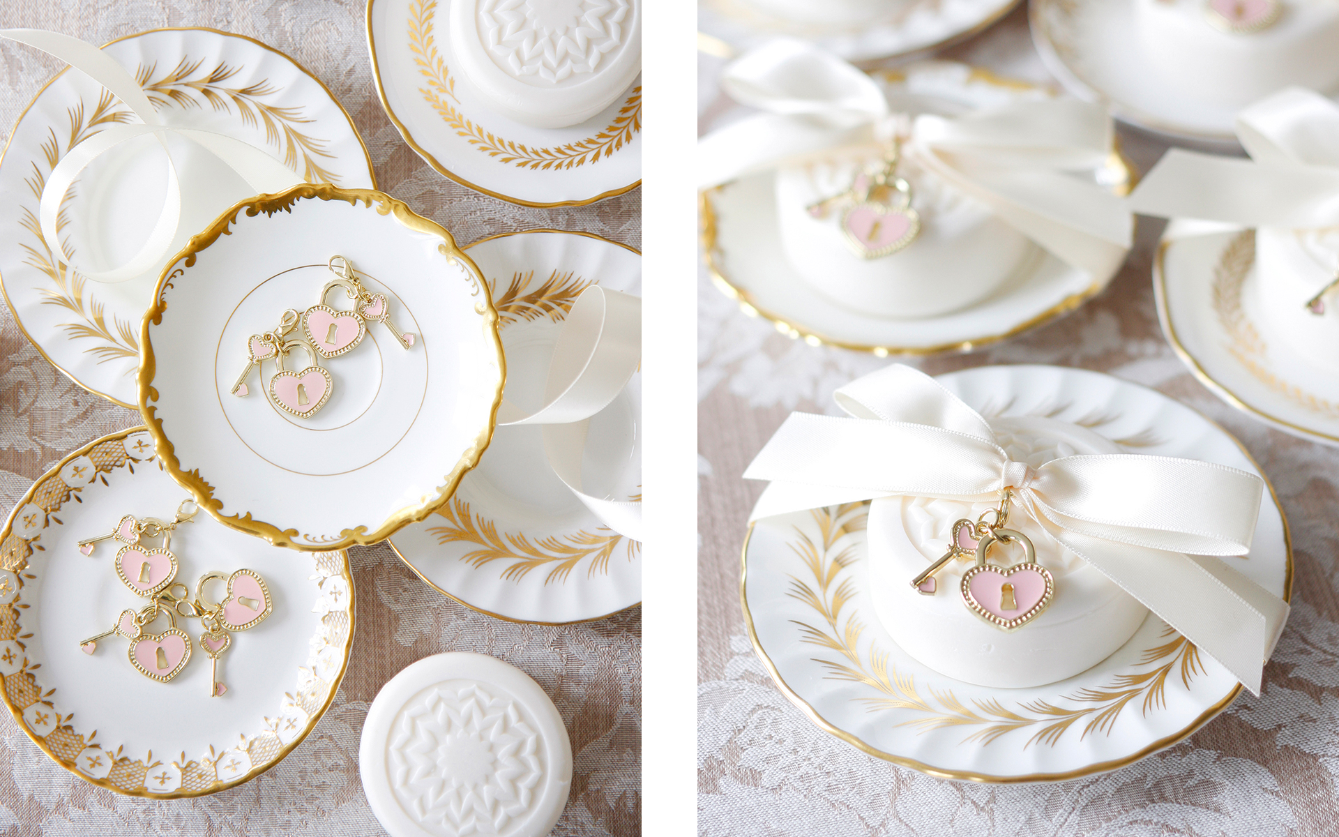
Valentine’s Day is one of my most favourite special days of the year. To celebrate the day of love at the LCBO, I designed this visual identity for the Valentine’s Day merchandising tool kit. Merchandising kits are provided to the retail stores to celebrate and decorate special occasions and holidays during the calendar year. Their other purpose was to discourage store staff from decorating with cheap and off-brand tchotchkes from the dollar store. Each kit provides signage and other components to promote the selection of curated products for each occasion. What’s not to love? Hearts, hugs and kisses!
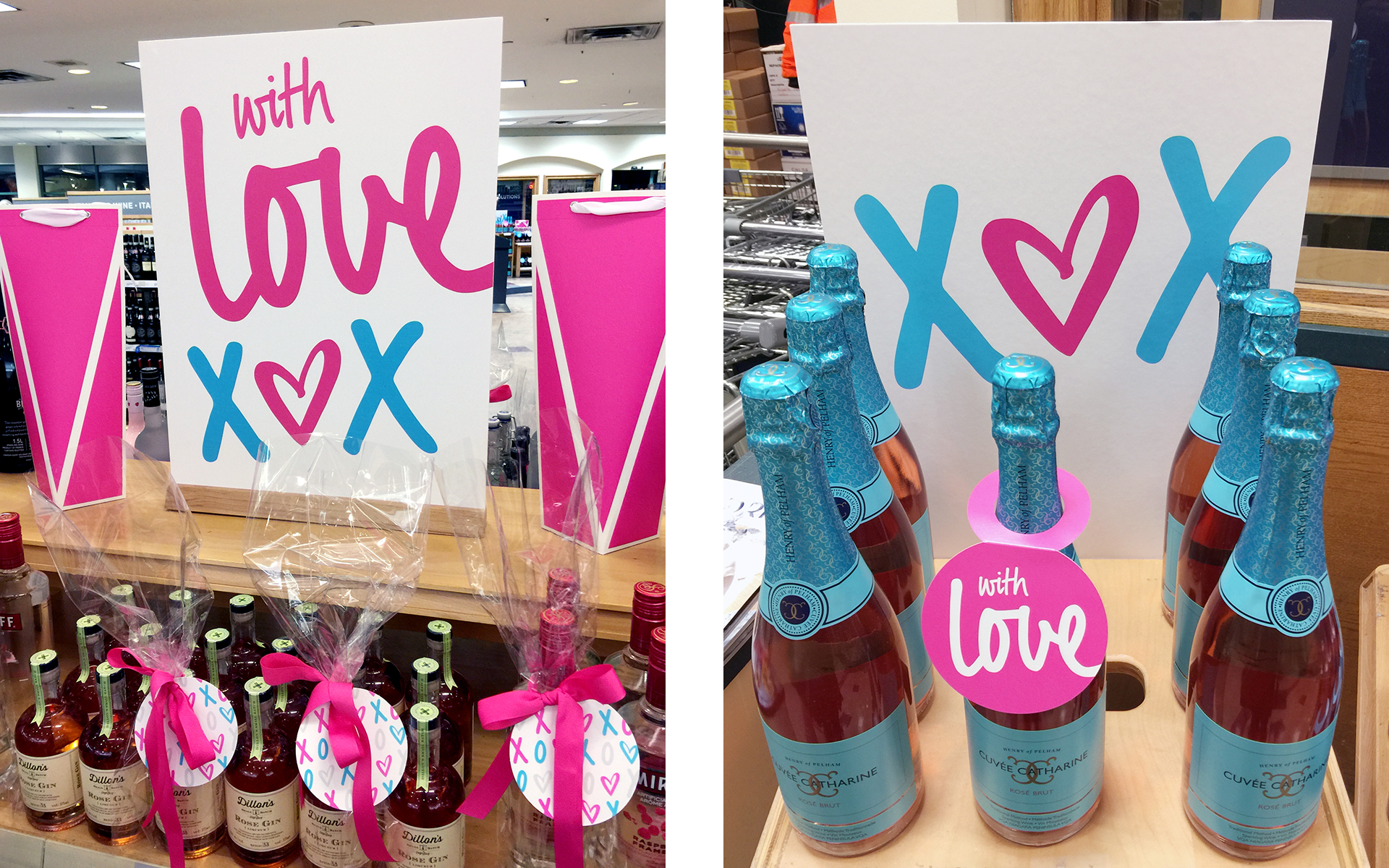
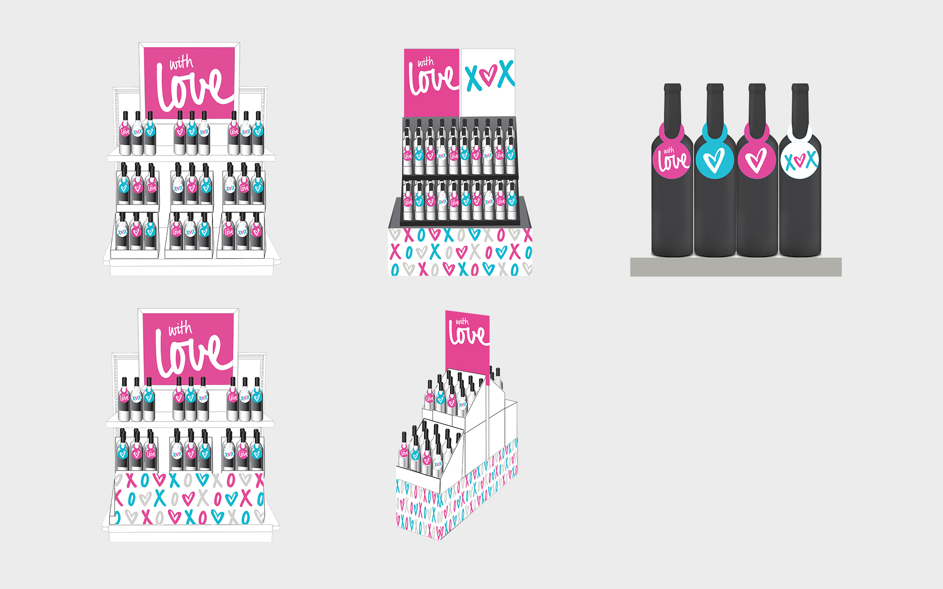
I was also responsible for an entire calendar year of merchandising kits for these holidays as well: Easter, St. Patrick’s Day, Mother’s Day, Father’s Day, Thanksgiving and Halloween.

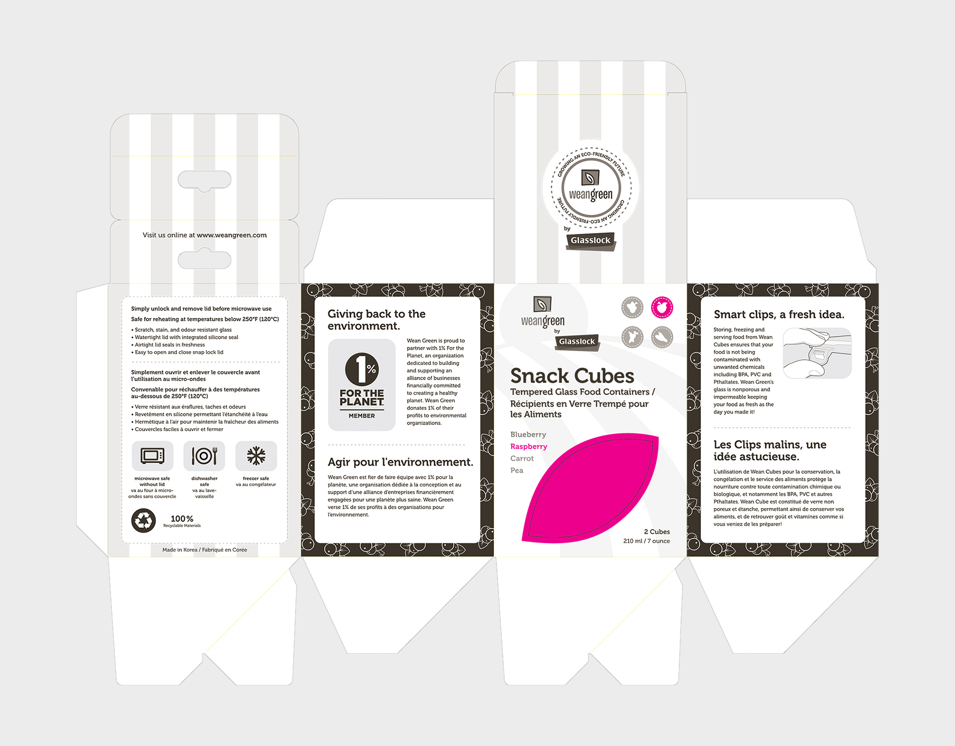
I am always excited to work on packaging projects, including this one for Wean Green, a company that manufacturers reusable tempered glass food containers. Started by an entrepreneurial mom with two young girls, her mission was to create eco-friendly, unbreakable and microwavable safe food containers. After the initial launch, the product line grew by adding additional shapes of the containers to suit the needs of busy moms. Since the branding identity for Wean Green was already established, my design skills were engaged to leverage the brand to create the artwork for five new skus in the product line.
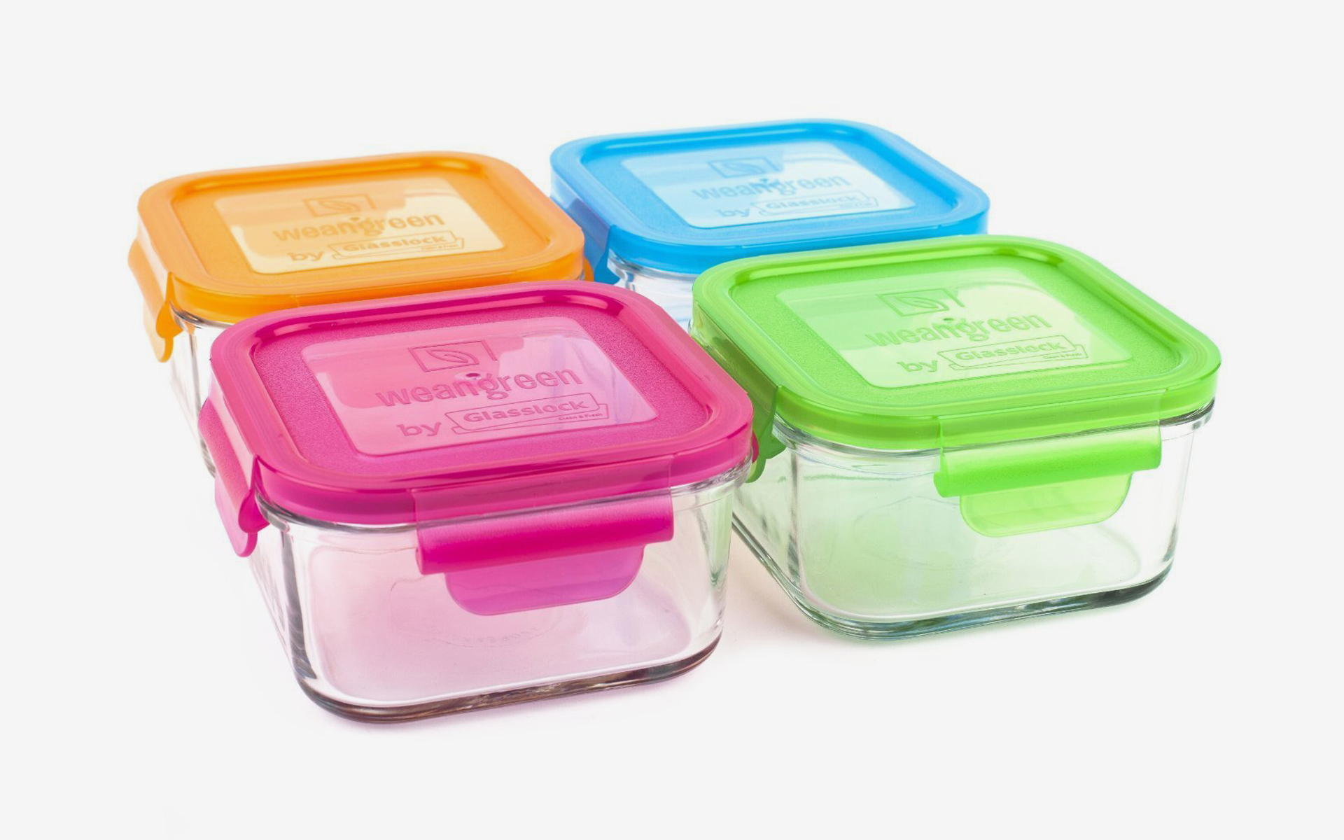
I loved working with the playful colour palette, inspired by healthy fruits and vegetables: carrots are orange, raspberries are pink, blueberries are blue and peas are green. In keeping with the eco-friendly nature of the product, the containers were packaged in 100% recyclable material and Wean Green donates 1% of their profits to environmental organizations (1% for the Planet).
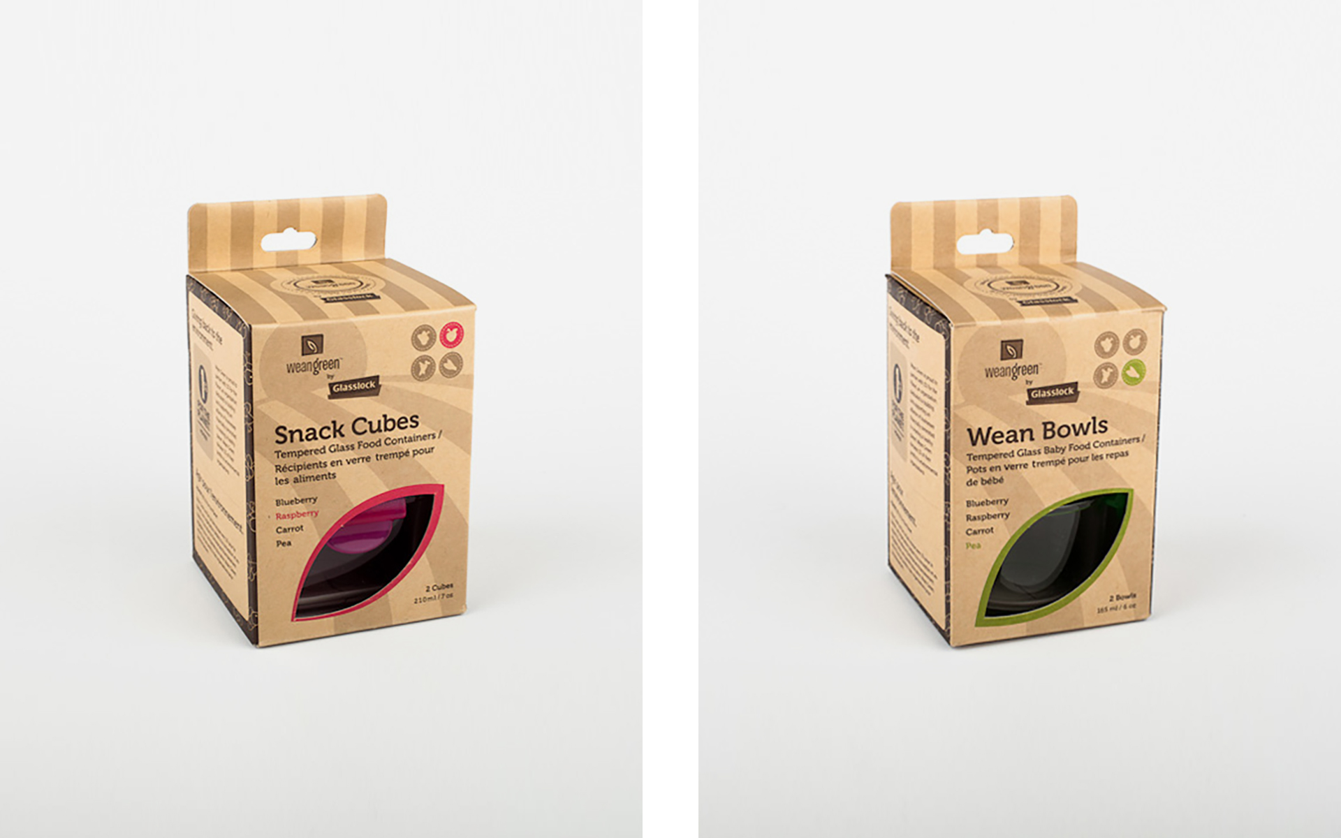
As the glass food containers were being manufactured in Korea, the factory was also responsible for the printing of the packaging. For efficiency and accuracy, I was provided illustrator templates for each new product sku from the printer. I proposed a new die line to be in a shape of a leaf, to visually connect back to the Wean Green logo.
The most challenging aspect of the project was managing the time difference between Korea and Canada. Working as a freelance graphic designer, I was able to accommodate my working schedule to be available ‘first thing in the morning’ — checking emails at midnight to follow up and make sure all aspects of the project was moving forward smoothly.
I designed this brand identity concept for Keaton & Co., a Toronto-based boutique featuring high quality, monogrammed goods for the modern home. Operated by small business owner Jennifer Martinez, each monogram is lovingly designed and stitched in her home studio on a decades-old embroidery machine inherited from her mother. Offering a vast selection of fabrics, thread colours and monogram styles, almost anything can be embroidered — including napkins, throws and pillows. After a few years in business, Jennifer desired a refresh of her current brand identity; something unique that communicates who and what she does.
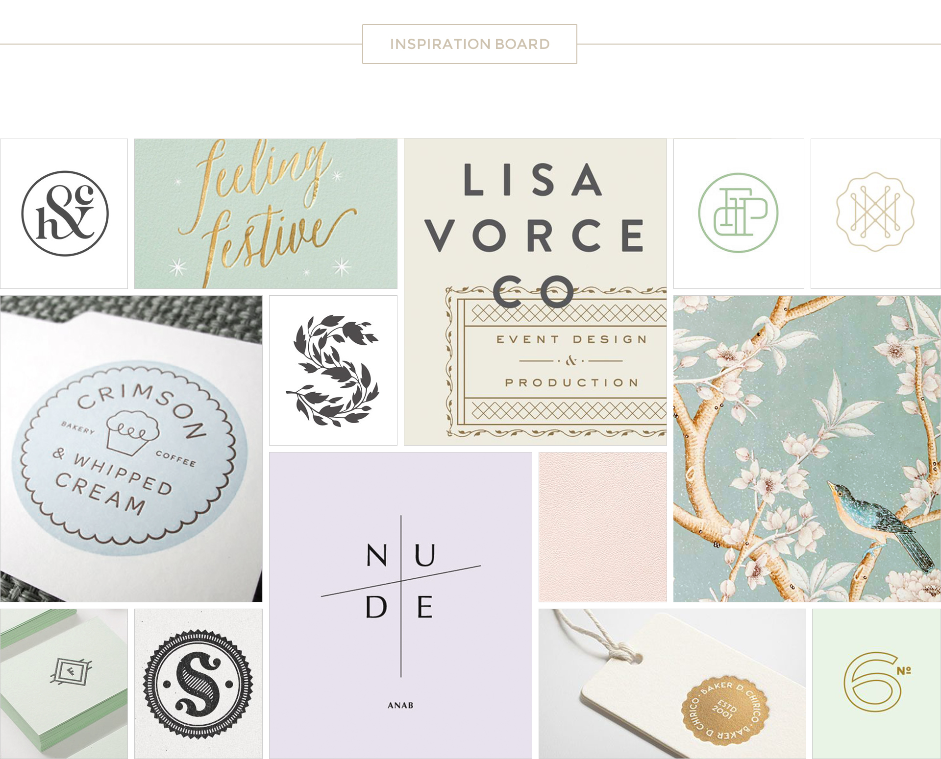
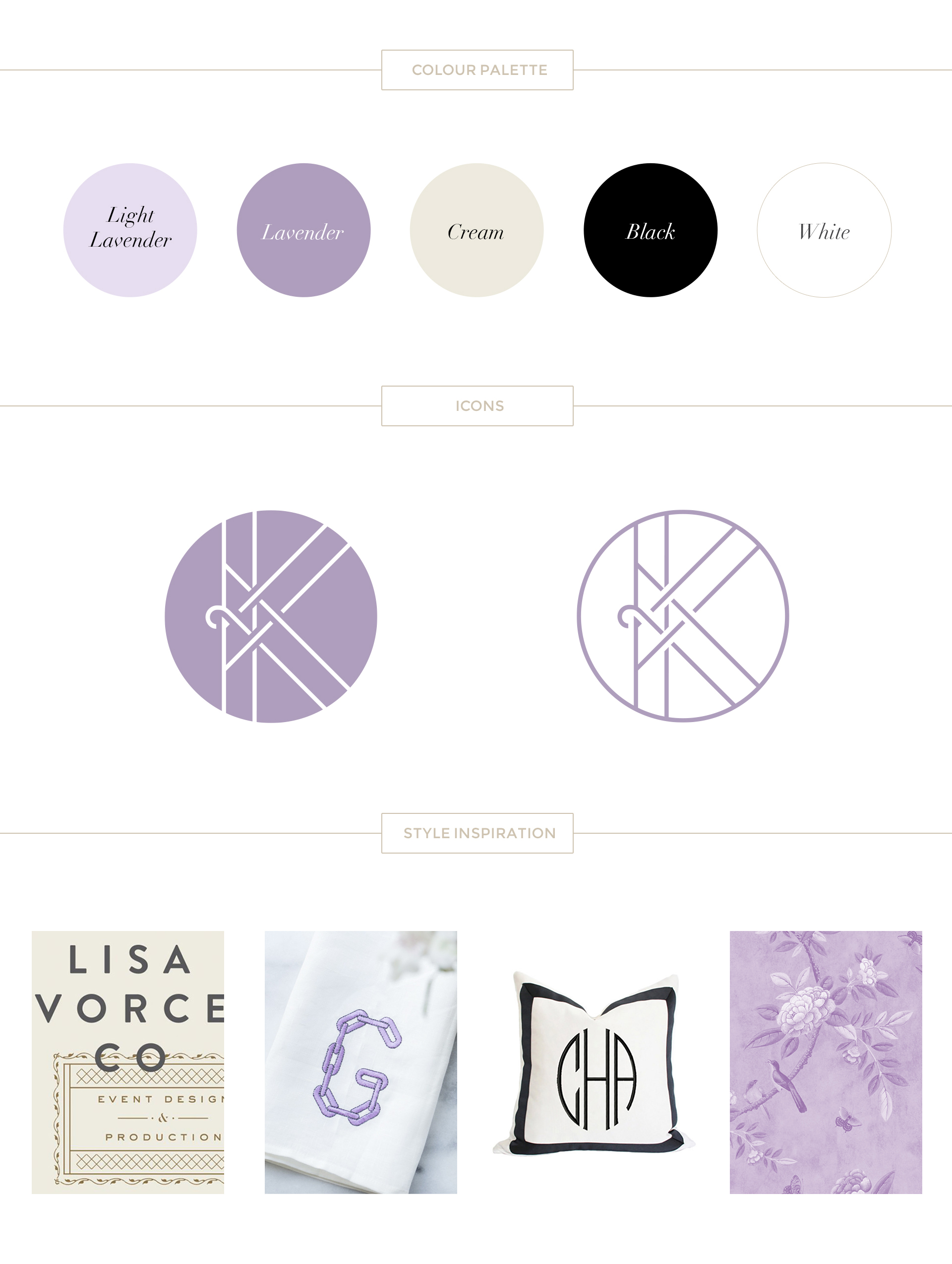
To kick-off the creative process, I suggested Jennifer start a Pinterest board — capturing anything and everything that visually caught her eye. From the broad range of images, I was able to see a common thread emerge — pale and muted tones, simple, clean lines — suggesting an understated modern design with a hint to tradition. I pulled these images together to create a beautiful and unified inspiration board.
![]() Taking inspiration and visual clues from the nature of her handmade business, I worked with the shapes and lines suggested by sewing needles used in the process of embroidery.
Taking inspiration and visual clues from the nature of her handmade business, I worked with the shapes and lines suggested by sewing needles used in the process of embroidery.
Guest Blogger on weddingstar.com
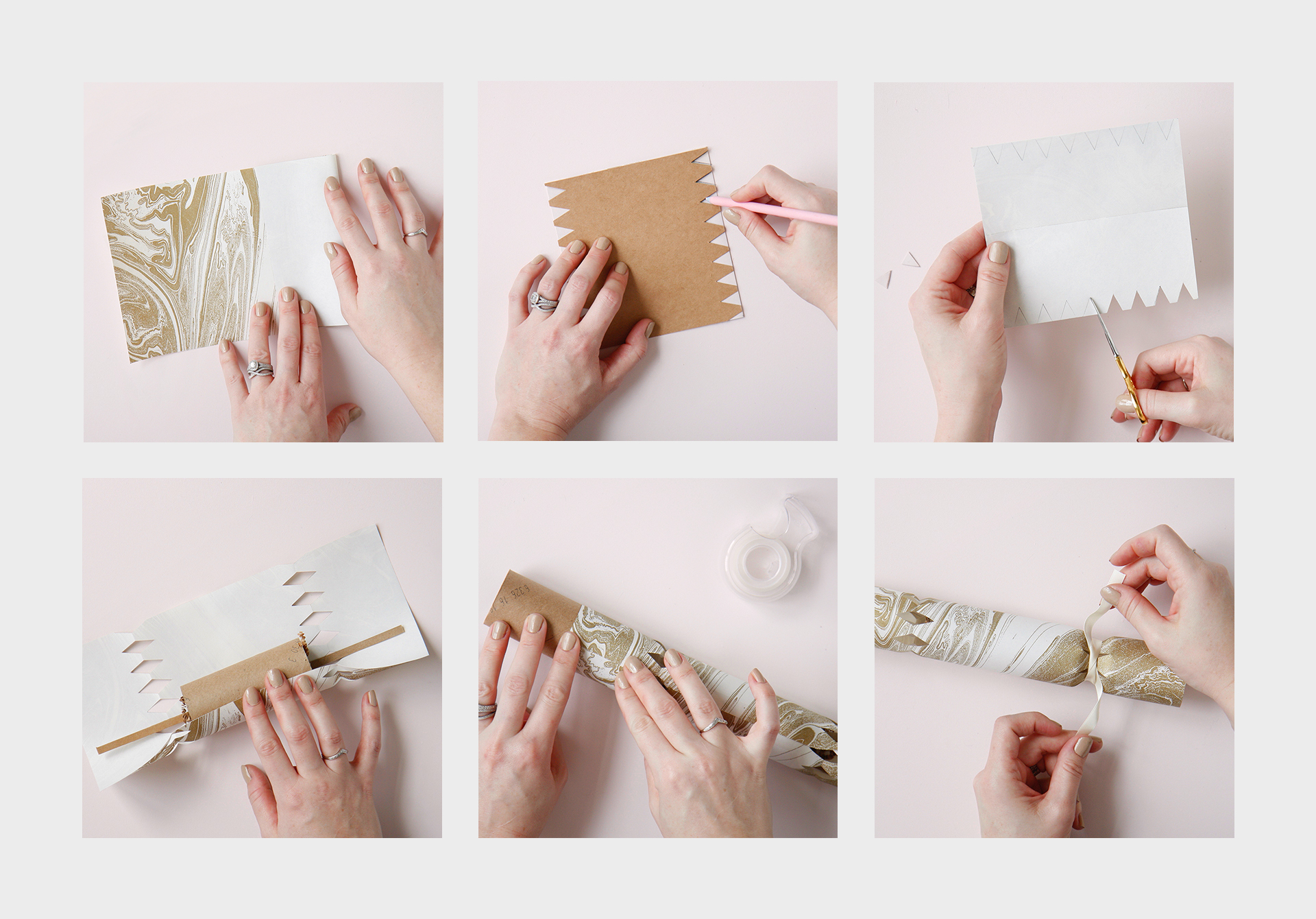

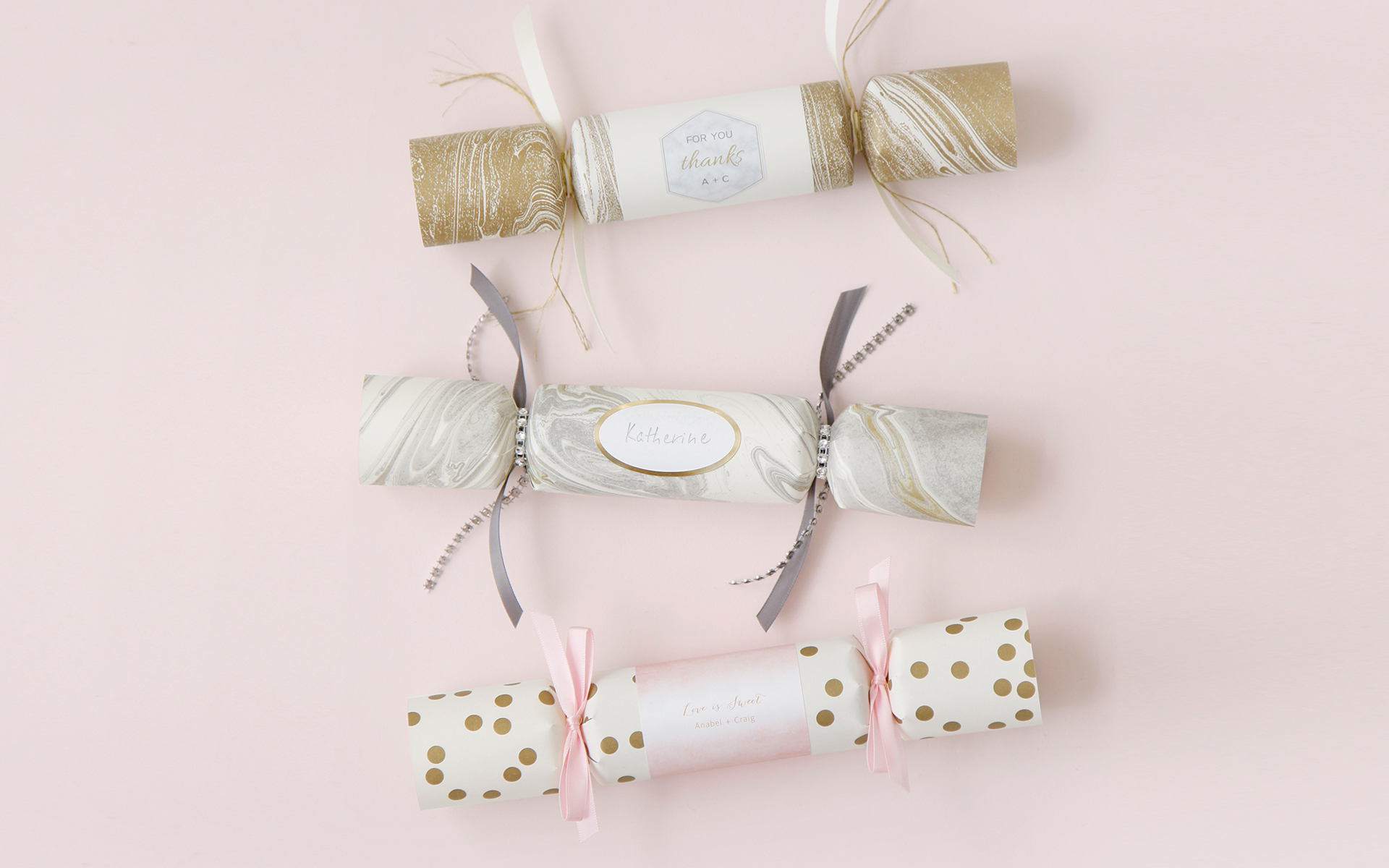
The first popper design is a thank-you favour with a special gift inside for the wedding guests. I repurposed paper from a table runner (Weddingstar product) in a gold marble design to make the popper.
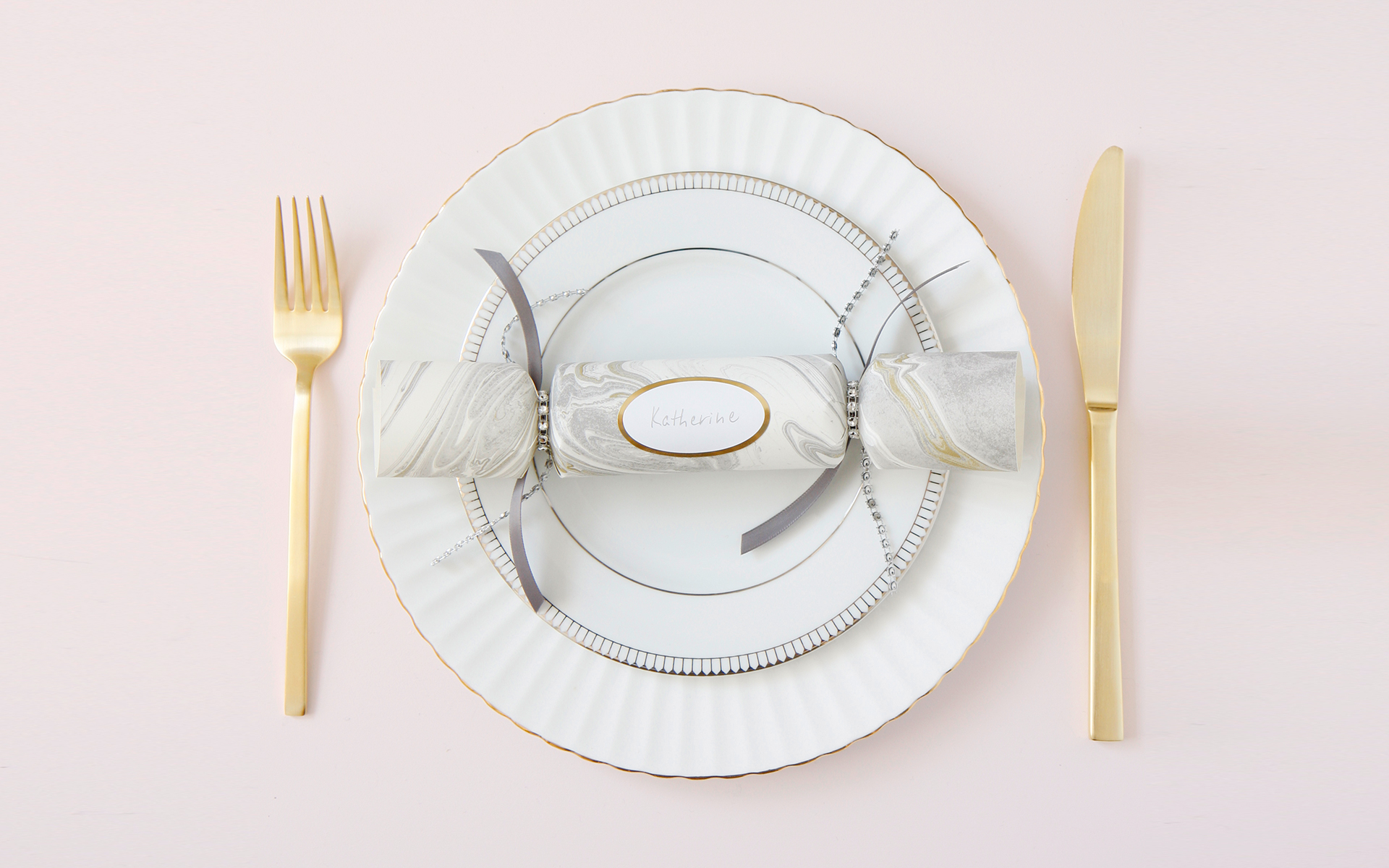
The second popper idea does double duty as a favour and name card for a truly personal touch for guests at the reception. I repurposed paper placements in a marble design (Weddingstar product) to create the popper.
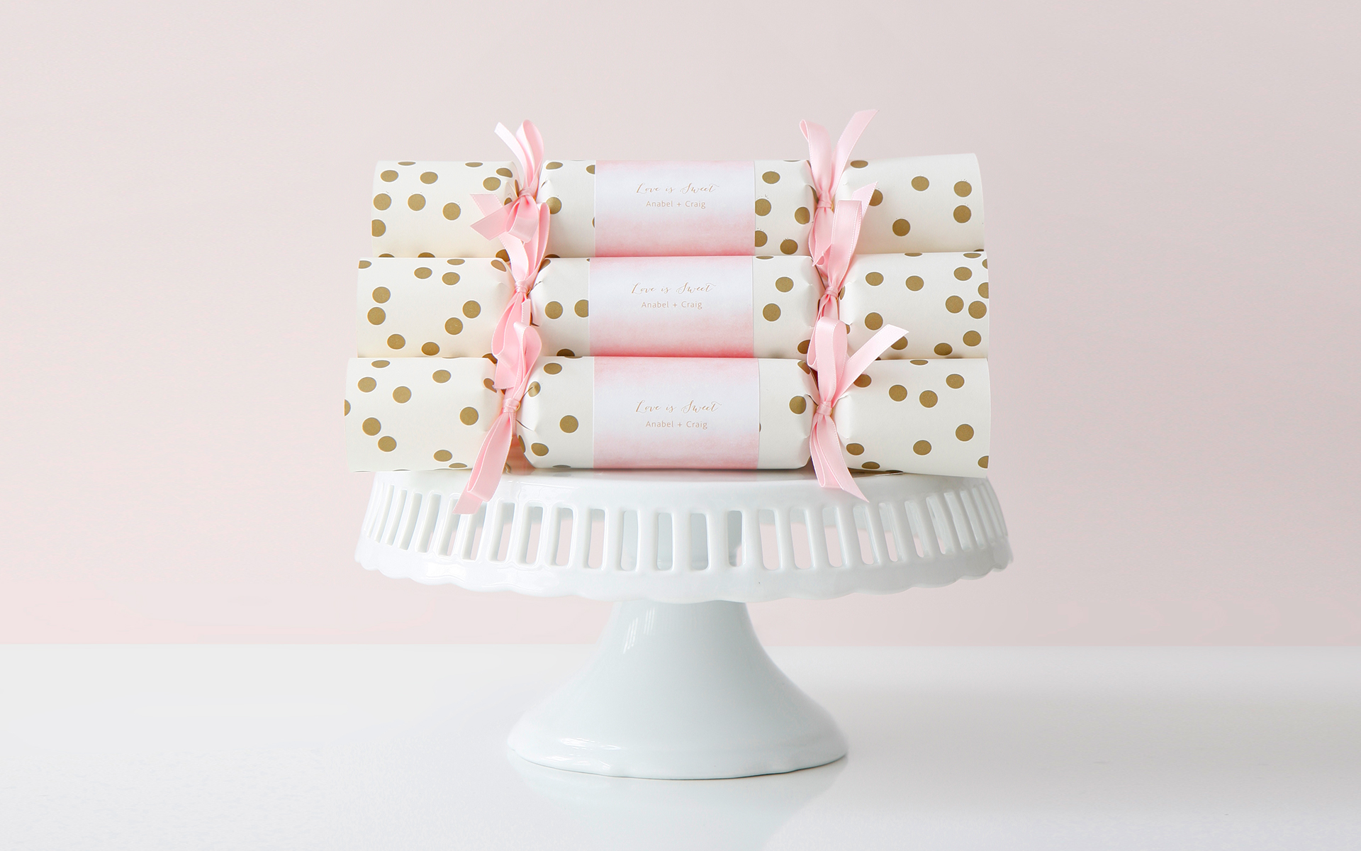
The third popper concept is intended for displaying candy (inside) on a sweets table. I repurposed paper from a table runner in a gold polka dot design (Weddingstar product) to create the poppers. Adding pink ribbon and label was the perfect final touch.
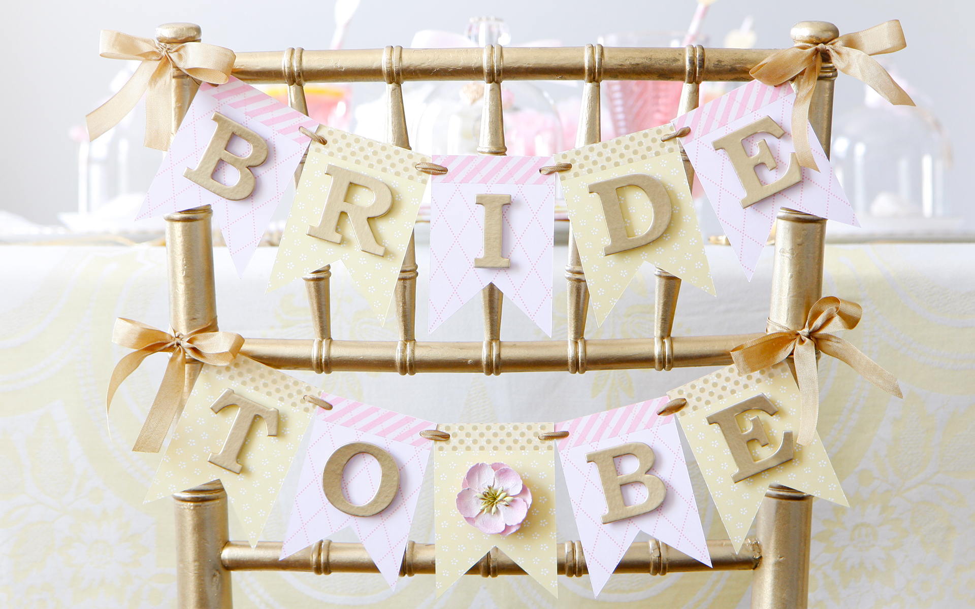
DIY challenge/tutorial published on bemakeful.com
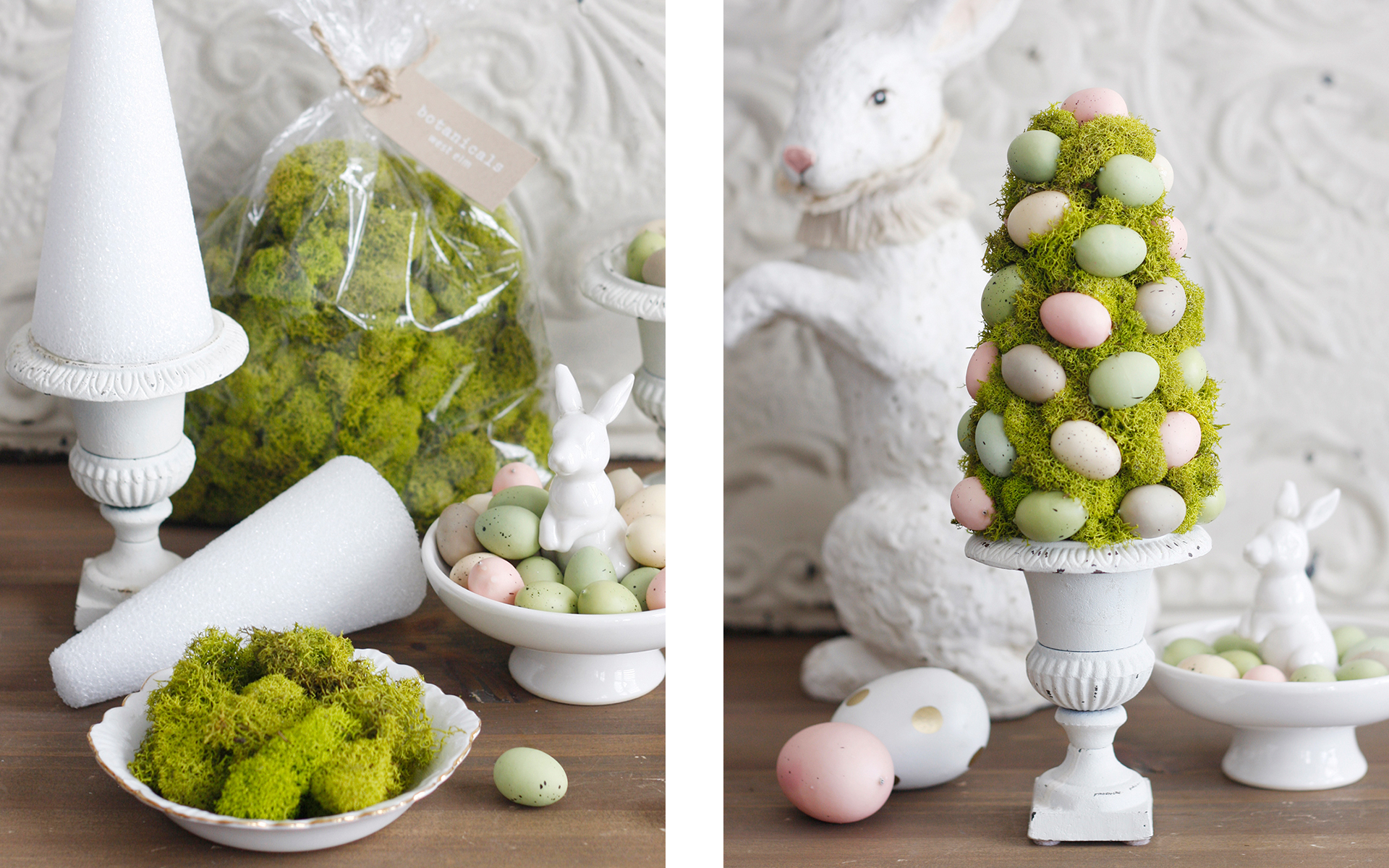
DIY challenge/tutorial published on bemakeful.com
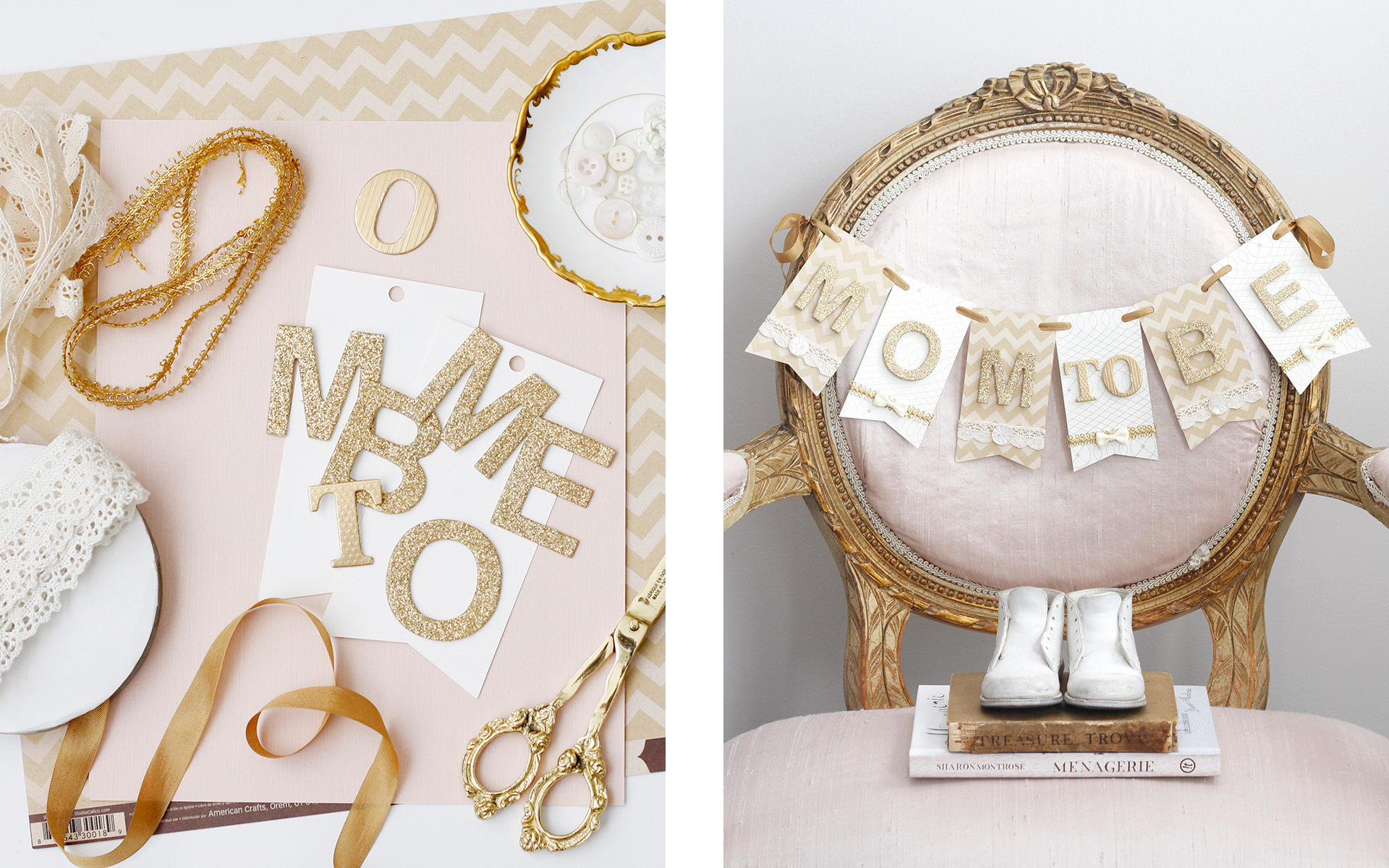
DIY challenge/tutorial published on bemakeful.com
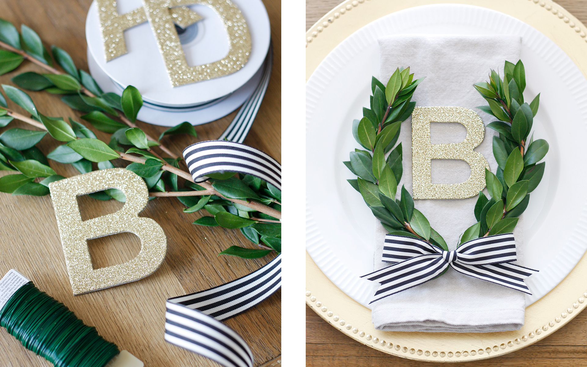
DIY challenge/tutorial published on bemakeful.com
DIY challenge/tutorial published on bemakeful.com